The new GoSquared Blog and Engineering Blog are here. We’ve been working on redesigning the GoSquared Blog for months, and we didn’t want to launch the new design without a thorough review of the processes we went through.
Hopefully by sharing our process, you can learn a thing or two for your next project – especially if you’re looking at mobile-first responsive design.
History
The GoSquared Blog started life back in 2007, known as Liquidicity. We were continuing to expand our collective knowledge of HTML, CSS, marketing, back-end coding, and a lot more, and wanted to share our learnings with our community of smart, creative, and extremely handsome people.
Over time, the GoSquared Blog and Engineering Blog have served 100s of millions of pageviews, and have been featured by highly respected organisations across the world including the BBC, The Wall Street Journal, Smashing Magazine, and thousands more.
Jump to to a short visual history of the design of the GoSquared Blog
Goals of the new design
- A beautiful, readable place to share insights, news, updates, and more with our community.
- It has to be easy to read on all devices.
- To create a frame for our ideas that is so beautiful we’ll want to publish our content there.
- A more effective channel to acquire customers for GoSquared.
Inspiration

We can’t pretend that everything in the new GoSquared Blog is 100% original – like all good artists (and many great ones), we borrowed and referenced anything we stole. Some of the folks that really inspired us:
Mobile first
The GoSquared dashboard and all of our apps have been responsive and mobile ready for more than 2 years. However, the GoSquared marketing site (as yet) has not made the transition to be as mobile ready. The GoSquared Blog has notably been challenging to read on mobiles, especially given the number of visitors who reach the Blog via Twitter, Facebook and other social channels that are most commonly consumed on mobile devices. It was clear we needed to rethink our desktop-first design strategy.
The new GoSquared Blog is the first time we’ve begun with designing the mobile layout. For anyone interested, view the CSS for this post and you’ll see how we’ve gone about mobile-first and then optimised the layout as screen size increases.
It’s been a refreshing project to work on, from a design standpoint. Starting with the mobile layout has ensured we only include the elements that are absolutely essential to the reading experience. Funnily enough, it’s amazing how few features, widgets, ads, banners, and other nonsense can be left out of a blog design when you start with and focus on what’s essential.
Navigation
A pet peeve of ours: go to almost any company blog and try and get to the homepage of the company’s main website. It’s tricky, and completely different depending on the website you’re on.
Some company sites have a global navigation, with a sub-nav for the blog. Some blogs completely ignore the concept of having a parent site and pretend they are isolated, making it very hard for a visitor to jump away from the blog and discover more about the company behind the blog.
A proposition for how company blogs should do navigation

Instead of cluttering the top of the Blog with global site navigation and further blog-specific navigation, what if we could give you the top links in one neat menu? How do we avoid the confusion of “does this link go the blog’s home, or the homepage of the company website?”
The solution: One link at the top left of every page, telling you that you’re on the GoSquared Blog, and a short explanation of what GoSquared does (something we believe should be on every single page of the site).
When you click or tap the “GoSquared Blog” logo, you don’t suddenly get thrown off your current page into a mystery location, you get a clear and simple menu with the option to go the GoSquared Blog home, the Engineering Blog home, or the GoSquared homepage. We could have put a bunch of other links in here, but keeping it to three means it’s a super fast and easy-to-learn navigation switch that solves all of the problems we wanted to address.
Typography
We paid a lot of attention to getting the basics of our typography right in the new GoSquared Blog theme.
- For example,
- We took a look at
- Unordered
- Lists
- We also took a good long look
- At
- Lists
- Of the ordered variety.
We tried to make the body copy as easy to read as possible. We took some inspiration from the fine folks at Information Architects.
Blockquotes got some love too – because everyone loves a good quality blockquote to quote around. On both desktop and mobile.
We also looked at headings too. Lovely headings.
Headings
Headings
Headings
And the best body copy we could come up with.
Code
Because of the Engineering Blog, we actually share a rather large amount of code with our fellow readers. We’re using the Prism code highlighter WordPress plugin to help do a good job on this. We also put in place a bunch of fixes to wrap any annoying long lines of code that would normally break the layout – no horizontal scrolling here!
Acquiring interest

The primary purpose for the GoSquared Blog, since we first launched it back in 2007, has always been to share our work, and make GoSquared better through collaboration and feedback from our community.
Only recently have we seen a dramatic increase in the number of people looking to stay up to date with our content through our weekly emails.
Thousands of people download our free resources every month, but even more read our blog posts ever day.
Email forms
Given the number of people that sign up for updates from GoSquared every week, we knew there was a huge opportunity to optimise the Blog as an acquisition channel even further.
On every page, we now have a MailChimp email signup form, with a hidden parameter passed in based on whether each signup is coming from the GoSquared Blog or the Engineering Blog. The intention is to send more focused and relevant emails to each segment of our community as our mailing list continues to grow.
Our most active social channel is by far and away Twitter. Now, on every page of the GoSquared Blog we have a custom “Follow us” button at the top right. We have also chosen to hide these extraneous actions on mobile and keep them in a slide down menu so that they don’t occupy valuable reading space on smaller devices.
Sharing
We are intending to swap out the default social sharing buttons for some custom designs, but for now we have the off-the-shelf Twitter and Facebook share buttons. There’s nothing we hate more than a blog covered in so many sharing buttons and features that you can’t read the actual post. Keep it simple.
Footer area

We made a bold decision to not include our global marketing site footer (which includes a mini site map on every page of the site), and instead focus the footer on highlighting the key benefits of GoSquared as a service.
We wanted to design a footer that was so beautiful it would actually be a pleasure to reach it at the end of whatever post you happen to be reading.
Going forward, the intention is to iterate the key features, selling points, and icons in the footer depending on the post and whether you’re on the GoSquared Blog or the Engineering Blog.
Crediting the writer
As a team, we’re ultimately working to continually evolve and grow the GoSquared brand. Often corporate blogs focus on this at the expense of highlighting the original author. We believe the voice of each post matters, and that exciting conversation can occur when the reader can engage with the writer.
Every article on the GoSquared Blog and Engineering Blog is signed off by the author, with a photo and a short description of their role at GoSquared.
Retina ready
Retina screens are becoming ever more prevalent – it’s not just lucky iPhone owners who can enjoy crisp graphics. The wealth of iPads, Android devices, and MacBooks that offer Retina quality screens is growing. The GoSquared apps themselves are now all Retina-ready, and so is our marketing site. Even our emails are Retina ready. So now the Blog is too. Thank you Retina.js!
Eating our own dog food
The GoSquared API is capable of much more than just pulling out stats for your own internal dashboards – you can use the GoSquared API to power real-time, data-driven changes on your site.
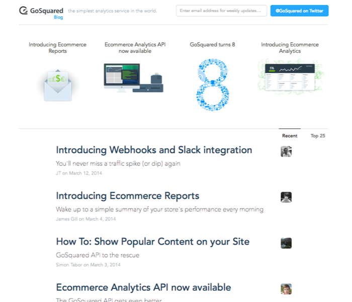
One of the great things about the API is we can easily use it to show the most popular posts on the Blog in real-time. So now on the homepage of the Blog, we have 2 tabs – one for most recent articles, and one for the most popular articles of all time. The list is powered entirely by the GoSquared API.
What’s even better – you can now build your own “top content” section on your own site, with the simple tutorial we released recently.
A short visual history of the design of the GoSquared Blog
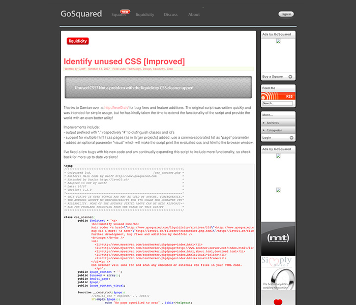
The original GoSquared Blog A.K.A. Liquidicity

Back in 2007
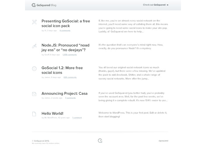
Growing up in 2010

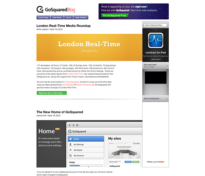
Evolution in 2011
A complete redesign in 2012
2013 saw the launch of our longest running theme

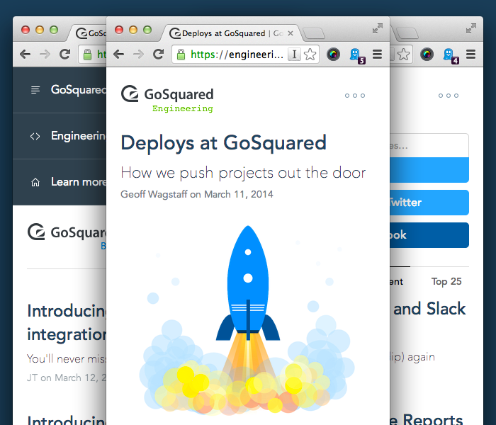
2013 saw the Engineering Blog fork onto its own path

And then March 2014 came along
Completely redesigned and dramatically easier to read
Feedback welcome
We’re excited to produce some of our best work yet on the new GoSquared Blog. We would love to hear any feedback, bugs, or other suggestions for improvement over on Twitter or via email.