When people think about growth, they often immediately jump to focusing on acquiring more users.
But if you’re building any kind of software product, the likelihood is your funnel is leaky as soon as users hit the “sign up” button.
If you’re still in the process of building your product, or if you’ve found you have a retention problem, the chances are it’s time to start getting serious about your user onboarding.
In this guide, our goal is to help you determine what user onboarding means for your product and look at a selection of best practices to help improve your user onboarding and get activation and retention moving in the right direction.
Contents
- What is user onboarding?
- Designing empty states
- Designing an onboarding flow
- Reducing the number of steps in your onboarding
- Set sensible defaults
- Gamify your user onboarding
- Email sequences in user onboarding
- The mobile vs desktop experience
- Testing your own user onboarding
- Measuring the effectiveness of your user onboarding
- Helpful resources to improve your user onboarding
What is user onboarding?

User onboarding is a broad topic and encompasses many fields and people. To kick-off, let’s see what the dictionary has to say about user onboarding.
“The management of the early stages of a relationship between a business and a customer.” – Collins English Dictionary
While we don’t wish to take anything away from the Collins English Dictionary – it certainly serves its purpose – we feel this is a rather dry summary of user onboarding.
In reality, from our experience both as makers of software, and as users, user onboarding often feels more like something from the game show Takeshi’s castle…

Takeshi’s Castle certainly gives a realistic summary of how most users onboard into our products. But for the most practical definition of user onboarding, and one that we think outlines the reason for working on the topic is outlined by the team at KISSmetrics:
“Activation is the first point where users achieve the value you promised.” – KISSmetrics
This definition neatly ties your marketing messaging into your product – and makes it clear that user onboarding is about getting users to the point where they are “activated”.
What are the best practices to improve your user onboarding?

Improving user onboarding can be a daunting task – there’s always a thousand things you want to improve, but here we’ll discuss the basics you may want to take a look at first.
1. Design the empty states of your product
Most designers enjoy designing a product in the mindset that a user has fully onboarded themselves – the “ideal” state that most users eventually get to.
But most users never reach the ideal state – they get past your join form and leave. Gone. Never to be seen again.
This problem is exacerbated when you’re building a SaaS product that you use yourself – you’ll have “onboarded yourself” many moons ago, and find yourself an expert in using your own product, with close 100% usage of your feature set.
We can’t stress this enough – if you’re building a product you use yourself, you have to step back and look at your user onboarding from the perspective of a new user frequently. As we’ll get onto later, there are a few practical ways to do this, but to start with, focus your design attention on the empty states of your product as well as the ideal state.
For example, if you’re designing an analytics dashboard, your natural tendency is to design a screen with lovely graphs and charts with conveniently complete data in all areas. This is critical, of course, because you need to know what that state of the product will ultimately look like. But make sure you also spend some time thinking about the “zero data” state – what does that dashboard look like with nothing in it?
Things to think about when designing your empty states
When designing the empty states of your product, think about answering the following questions:
- What has a user done to reach this screen?
- How long will this screen be in this state for the user?
- How does the user make use of this screen when there is no data?
- Is the interface clear when there is no data?
- Are there hints to the final functionality of this screen that we can surface when the screen is empty?
- Can we educate the user about this feature from the empty screen?
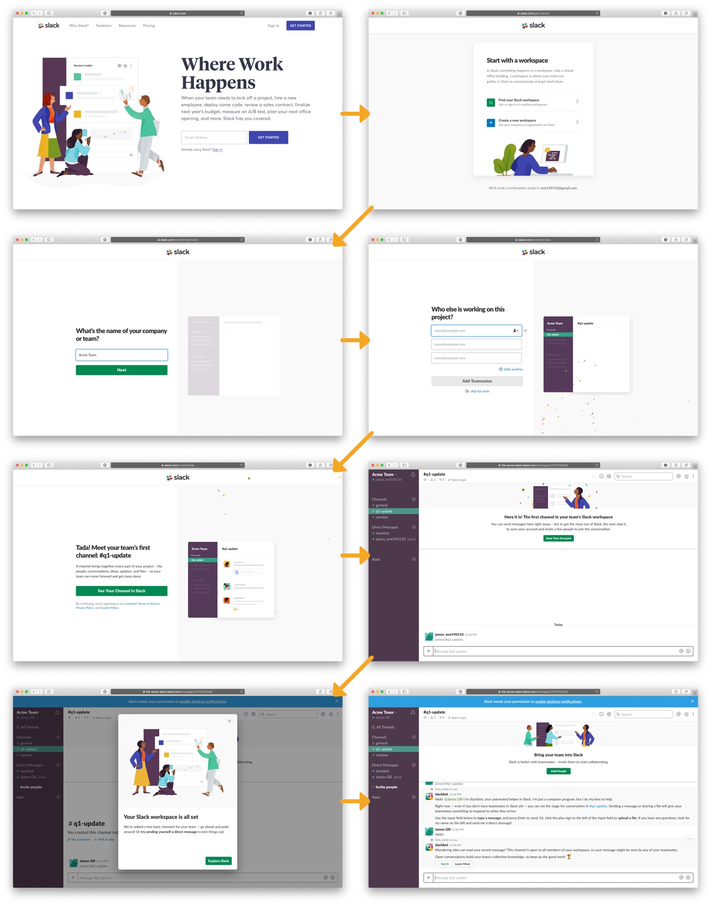
2. Design an onboarding flow, not just a single screen

Following on from thinking about your empty states as well as your “ideal” states, it really helps to think about your user onboarding as a flow.
You don’t have to get too technical here, but make sure you’re thinking about, at the very least, a simple linear flow – from start to finish – for your user onboarding.
Where the “start” and “finish” of user onboarding is for your product may not be an easy question to answer, but we’d suggest outlining the full journey as best you can.
Where does your user onboarding start?
For example, before signing up, a user will likely head to your homepage, perhaps see your pricing page, head to your sign up form, and then enter into your product’s user onboarding flow. But the step before that is often overlooked – what drove that person so go to your homepage in the first place?
While the drivers of visitors to your website may feel like more of a marketing task, you need to know the reasons people are even considering your product so you can ensure the user onboarding doesn’t alienate them or push them away.
Where does your user onboarding finish?
You can easily argue that user onboarding never finishes – there will be new features, new requirements, new possibilities in the future that neither you or your customers know about today.
But in terms of moving from “new user” to “seeing value for the first time”, you’ll likely be able to map out a journey that may span multiple user sessions to help you visualise the hurdles your users need to jump through to get to a point where they see value.
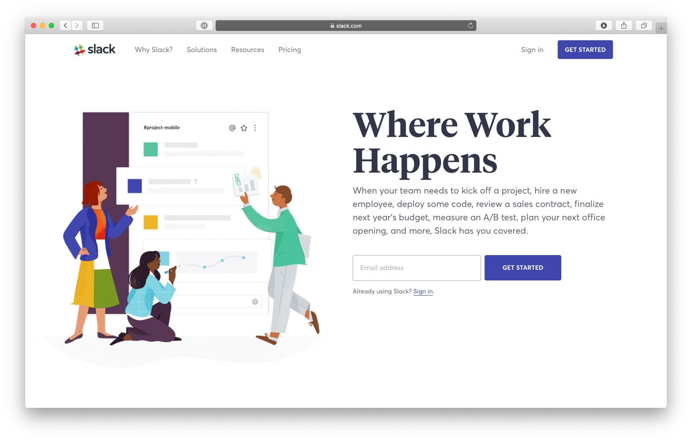
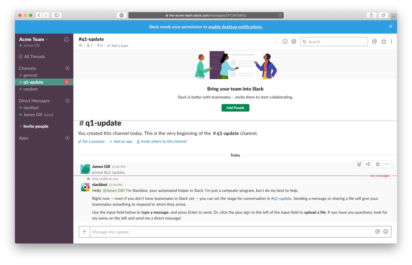
Example: Slack
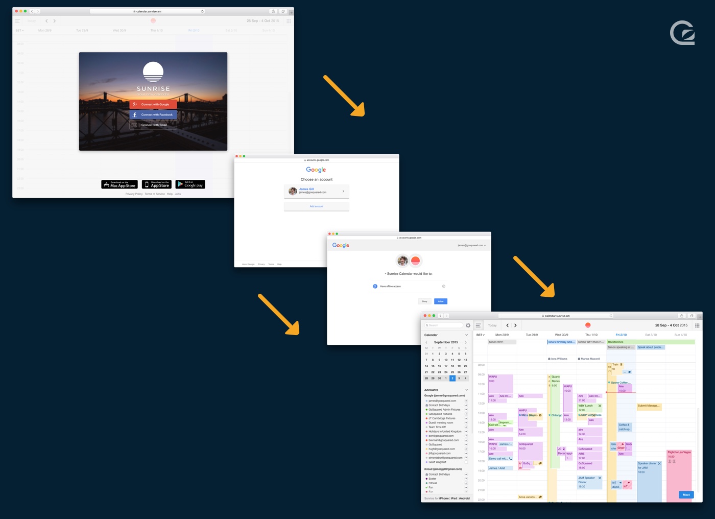
3. Reduce the number of steps in your user onboarding flow

Once you’ve mapped out your user onboarding flow, you’ll have a much better idea of how to improve it. One of the most obvious steps to take next is to figure out whether there are any steps that don’t need to happen on the first session.
A good question to ask is: How can you get your new users to their “Wow” moment as quickly as possible?
It’s worth bearing in mind that a “step” or “click” isn’t necessarily bad – some steps can be critically important for adding clarity to the process for the user. But steps that require some form of action can act like hurdles that a new user must jump over. And most people aren’t too good at jumping over hurdles.
A great way to find out which steps are problematic for users is to watch real users go through your onboarding. If you can’t do a real user test, then we’d recommend using a tool like FullStory or HotJar to watch the user sessions of people moving through your onboarding so you can see first-hand where new users are tripping up.
Example: Sunrise

4. Set sensible defaults

Following on from reducing the number of steps in your user onboarding flow – a great way to remove steps is to set sensible defaults for certain features.
Many products are best when they’re tailored to a user’s needs. Ultimately the user is best served if certain settings – like their profile photo, their bio, or their timezone – are set by them. But these settings can be too cumbersome to deal with in the minimal time you have to convince a new user that you’re right for them.
For settings that can be edited later, figure out how you can set sensible defaults for anything that doesn’t absolutely need to be set by the user from day one.
Example: setting your timezone
For example, in GoSquared, it’s essential that you set a timezone for your account so that your GoSquared Analytics data shows correctly.
We used to ask new users to set this on their first session, but we realised a couple of things:
- Most people hate picking timezones and aren’t experts on what timezone they’re in. They know the time of day, but not necessarily their timezone or what it’s called!
- Users can edit this at a later date if they guessed wrong.
What we realised was that we could automatically detect the IP address of a user to set their timezone for them. It wouldn’t be 100% accurate – there are occasions where we’ll get that IP detection wrong, but the number of times that happens is likely to be the same as or less than users getting their own timezone wrong.
We ultimately decided to set the timezone for new users automatically for them, and for the small segment of users that find their timezone has been set incorrectly – they’re at least in the product and able to see the value, and can make their way to a settings screen to change it. Overall this outcome is far better than turning a new user away over such a trivial – but challenging – setting.
5. Gamify your user onboarding

Gamification can seem like a buzzword these days, but it plays a big part in some of the most successful user onboarding flows.
The concept of gamification spans many ideas, but when it comes to user onboarding, the more you can make the process fun, enjoyable, and interactive enough that users want to complete the next step, the higher your chances of moving someone through the funnel to success.
Show progress towards a goal
One of the hardest thing with user onboarding is encouraging new users to make it through a series of steps to get to an ultimate “successful” state. Often, there are many steps required, so ideally you want to communicate the number of steps and the ultimate goal clearly to the end-user.
Making the goal exciting and rewarding is critical – the pitch of value that you sell on your marketing site should ideally be reiterated in whatever outcome you’re trying to push someone to in your onboarding. You’re not aiming for someone to simply “use feature X” – you’re aiming for someone to “be more successful”!
In showing progress towards your ultimate goal, you will also want to try to break down any larger steps into smaller, more actionable steps that can be jumped through. As in real life, if you’re going to write a book, don’t set your task as “write a book” – set it to “write a sentence” and you might actually start to build the initial momentum that takes you on the right path.
Utilise checklists
When you have a series of steps towards a goal, it’s a great opportunity to employ a checklist in your product. Checklists are magical in that people often naturally want to complete them – there’s a particular dopamine hit we get from finishing things.
A handy tip to encourage new users to complete a checklist is to show steps that are relevant and important to the user, but also to show at least one step as already complete – encouraging the user to already feel like they have a level of commitment.
For example, if you have a project management app, your first step could be to “create a new project” that could happen by default as part of the account creation process. From what we’ve seen, a checklist with one of five steps complete is likely to be considerably more effective than a checklist with only four steps, all of which are incomplete.
Make it fun
Finally, games are fun. When thinking about the gamification of your user onboarding, think about where you can add fun and delight to the experience so that you bring some joy to someone’s day.
When used sparingly, a fun animation, a friendly icon, or even just some entertaining copy can bring the smile to a new user’s face that encourages them not to give up, to push through, and commit to trying our your product.
Example: Apple Watch setup


6. Define your email sequences for user onboarding

If you often find yourself designing screens within an application, it can be easy to get carried away and ignore the existence of other touchpoints that users have with your business as they onboard themselves.
Emails are a critical part of user onboarding that can get overlooked in the design process. Try not to leave user onboarding emails solely in the hands of the marketing department, or to customer success – the best user onboarding flows treat emails as integral to the product experience.
So make sure you loop everyone in when working on user onboarding – from marketing to sales, to customer success, to everyone needed on product.
Here are a few handy tips for ensuring your emails are on point:
Don’t send too many emails
Don’t go email crazy – if you want to ensure your emails are actually noticed or seen by your users, be selective about what you send and when you send it.
If you already have a product, with existing users, a good exercise is to look at what emails your users may receive in their first few days of using your product. For instance, your product may send automated reports, or notifications, in addition to any onboarding emails. But you may also have other emails such as feature releases, and even personal sales messages from your sales team – these can all add up and bombard a new user.
Ensure your emails are relevant
Make sure the few emails you send to users are actually relevant – this may sound really basic, but ensure the emails you send are based on triggers and up-to-date user data.
For example, don’t ask users to set up a feature they’ve already set up, and don’t send messages about features that don’t make sense until the basics are well understood.
Send emails from real people
While you may wish to come across as a “proper company”, it doesn’t mean your emails have to come from a generic company account. Sending emails from one of your team, especially featuring a photo and a real name, will give the user a name and face to connect with, and give you a much greater chance of having your emails opened and engaged with.
Allow users to reply
It may sound crazy, but many companies still send email out from “no-reply” email addresses. This seems crazy in a world where you need to be getting closer to your customers, rather than distancing yourself from them.
Importantly, ask yourself: is it really OK for your business to send out emails to your customers and enter their inbox any time of the day, without allowing them to respond or do the same back?
In addition, some of the best emails encourage a response and begin a conversation – it’s impossible to truly engage and connect with customers if you’re preventing them from replying to your messages.
Subject lines are 80% of the work
The likelihood is your open rates have room for improvement.
The obvious place to improve open rates is to improve your subject lines. You ideally want to A/B test subject lines (and even keep the content of your emails the same) to see what encourages people to engage.
A few handy resources for writing great subject lines:
- MailChimp’s best practices for email subject lines
- CampaignMonitor’s epic guide on email subject lines
- OptinMonster’s best email subject lines
Have a single call-to-action (CTA)
It may seem challenging, but trying to focus every email to have one clear action – and one clear call to action (CTA) can really help improve the entire focus of each email you send, and encourage the reader to make a binary decision – do or ignore.
If you send emails with too many links or possible actions, you’re forcing the reader to put extra effort in to choose between multiple options. The more thinking the reader has to do, the more likely they are to ignore your email, hit delete, or move swiftly on to another task that’s more important to them than figuring out your product.
Deliver happiness
In every email you send, think about how you can make someone’s day a little better.
Often when we send emails we are keen to ask customers for something – whether it’s asking to hop on a call, for them to try a new feature, or to upgrade their plan, we naturally want them to take certain actions.
But to build the best experience, and to drive users to engage, activate, and stick around, you want to deliver value to them. In your emails, can you bring a smile to their face with a fun quote, joke, or GIF? Can you give them a hint or tip that’ll help them do their job better?
With every email you create, try to think about what you can give your users, not what they can give you.
7. Consider the mobile and desktop experience

The trend to increased mobile usage is showing no signs of slowing down, but are you designing your product with mobile users in mind?
It’s especially important to consider the mobile experience as your product becomes more advanced with more features across both desktop and mobile. For example, if you have a mobile app in addition to a web app, do you need to change functionality once they install the mobile app? Can users onboard for the first time through your mobile app, or do they need to sign up via your desktop website first?
It’s a privilege to earn your place on someone’s mobile device as an installed app – so treat the honour with respect. While you may find considerably higher engagement rates with users who have your app installed, the last thing you want to do is push them away through abusing the relationship.
For example, it’s possible to send users onboarding messages and more via push notifications – instead of using email – when a user has installed your app. These push notifications will likely gain the attention of a user far better than an email sent quietly to their email inbox. But if your push notifications are not providing the direct value a user expects, and instead are asking the user to perform more actions or take specific steps to onboard further, the chances are they’ll be uninstalling your app before you know it.
8. Sign up for your own service every week

One of the most powerful things you can do to improve your user onboarding is also the most actionable – sign up to your own product!
It’s so easy to forget the user onboarding flow for new users – especially if you’re building a product that you use yourself. The chances are you’re happily using your product every day, and spending most of your time in that “ideal” state we spoke about earlier.
Most of your users never get to that “ideal” state though – they spend about 10 seconds clicking around and then leave, and then they never come back.
Immediately, you can go and sign up for your own product after reading this post. But to ensure you don’t forget, you can add a recurring event in your calendar – perhaps once a month, or even once a week, to run through your own user onboarding and see how well it matches what is on your marketing website, and what’s actually in your product.
Go create that calendar event now!
9. Measure the success of your user onboarding

Define what successful onboarding looks like
You can easily drown in metrics when building a company. There’s never a shortage of stats or numbers to look at – from your Twitter follower count to your monthly recurring revenue (MRR) – you’ve always got numbers to worry about and get excited about.
With user onboarding and user activation, it’s important you focus on defining a qualitative measure of a successfully activated user. That may sound a little sophisticated, but all we mean is: figure out what a successful activation looks like to your business and articulate it as a sentence that everyone on the team can understand.
Once you have a qualitative explanation of a successfully activated user, you’ll be in a much better place to start implementing tracking and metrics to define activation quantitatively.
You ultimately need a number, but if you skip the qualitative part, you can end up getting lost in a sea of metrics, and having five different interpretations across the team of what a successful activation looks like.
For example:
- GoSquared: “You see visitors on your website”
- Twitter: “You follow 20 people”
- Dropbox: “Your sync your first file”
- Uber: “You arrive at your destination”
Measure onboarding by cohort
If you don’t measure metrics like user onboarding by cohort, you’re going to miss the improvements and changes you’re making. When you look at totals, any changes will be completely lost and masked by all your other users.
Breaking your metrics out into cohorts – ideally by the week they originally signed up – will enable you to see improvements (or drop offs) in your user activation numbers, and cut through the noise that may be caused by external experiments such as marketing campaigns and other promotions.
Helpful tools and resources to improve your own user onboarding

It’s reassuring to know there are many people out there in the world that focus solely on user onboarding, so we can stand on the shoulders of giants to make our own products and services better.
Below, we’ve outlined some of our favourite tools and resources for making our own user onboarding better – we hope you find them useful!
Marvel for testing prototypes

Marvel is a really handy tool that we’ve used at GoSquared for years to mock-up prototypes and easily tie together multiple screens into flows you can put in front of real users. You don’t need to build real interfaces or write any code to see if an interface or user flow makes sense to users!
FullStory for observing onboarding sessions

FullStory can be a little addictive – it enables you to watch session replays of users going through your product and spot where people are being tripped up. We use FullStory extensively at GoSquared to understand our onboarding flows and continuously improve them.
Nickelled for onboarding tours

Nickelled is a great tool for guiding users around your product with tooltips and pointers to draw their attention to key features.
AppCues for guided tours and checklists
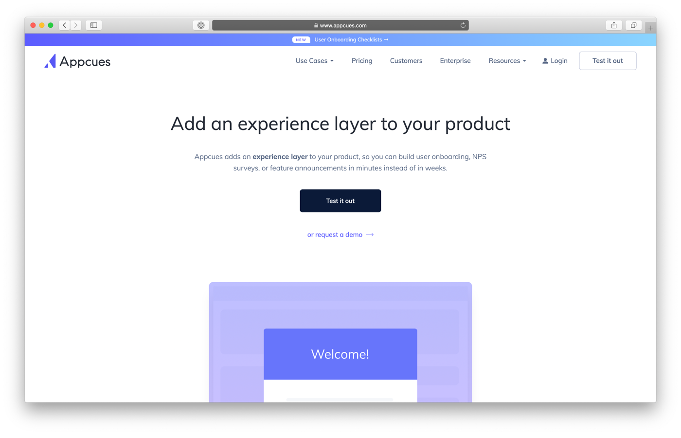
AppCues is a powerful product for guiding users around your product and adding other elements that can really help with onboarding users – all without writing code or requiring time from your engineers.
Userpilot for in-app modals and guided tours

Userpilot is in a similar category to AppCues in that it’s a software product to make life easier for anyone tasked with improving user onboarding. Userpilot helps you easily build guided tours and helpful in-app modals without needing to write a line of code.
UserOnboard for inspiration

An inspiring selection of user onboarding teardowns to help you see what other companies are doing to onboard their users.
GoodUI for proven UI patterns

Tons of interface patterns tried and tested that you can borrow for your own products and interfaces.
LittleBigDetails for delightful user experience ideas
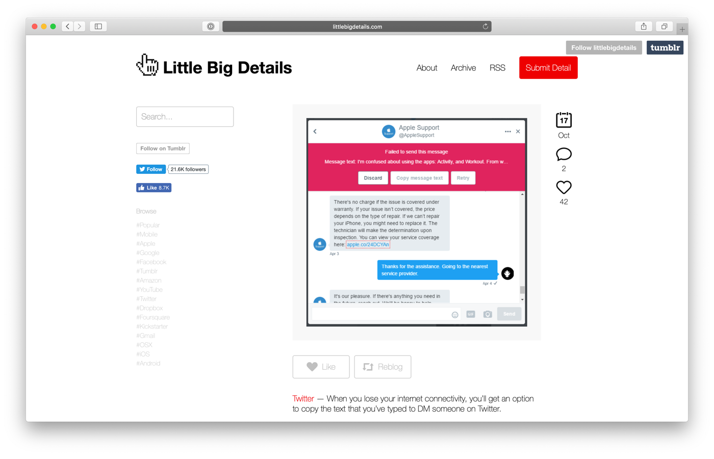
The details are often what makes the whole experience. This site collects the delightful little details in products that may go unnoticed and highlights them for all to see.
Andrew Chen for smart thinking on product

Andrew Chen is one of the smartest product people out there – he shares a lot of his wisdom on his blog.
Other GoSquared guides that you may find helpful:
- Our guide to user testing and running users tests on a budget of $0
- How to design and write effective call-to-action (CTA) buttons
Onboard and upward

Hopefully, you’re now brimming with ideas to improve your product’s user onboarding. If you have further ideas or experience you’re keen to share with us on your user onboarding successes (and failures!), then we’d love to hear from you – ping us on Twitter or via Live Chat.