Being a successful creative has a lot to do with the way you work.
You might not be able to teach taste or talent, but you can definitely sharpen your skills and make the most of what you’ve got.
We love design. It’s a fundamental part of our business. We can help you automate your sales process, make customer service more efficient, and understand how your business is performing so that you can get back to designing a brilliant product and growing your SaaS business.
Update September 2020: We are back with this updated list featuring not only James’ original list but more great advice from our friends Will Kinchin and Manifesto Studios.
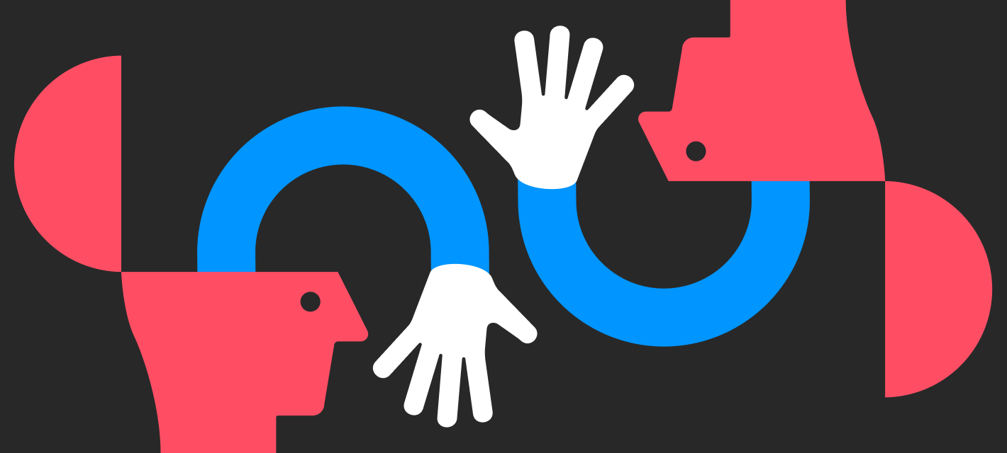
Find new ways to open your mind and not get stuck.

1. Use metaphors to expand your imagination.
Great ideas can stem from using themes and metaphors. As an exercise try thinking about your site design or concept as a building – a school, for example. This can open up a whole avenue of new ideas. Remember that great design is more than just a pretty face, it works because the theme houses the content seamlessly.
2. Don’t take all day to brainstorm.
It always helps to throw ideas around with a colleague or friend. Try to have a couple of short sessions of brainstorming rather than one massive one as ideas can quickly go cold or you can get into a loop of the same thought patterns. Though it’s useful to tap up your designer friends for ideas and brainstorming sessions, think outside the box and ask someone different – your mum, a friend who doesn’t design, a colleague from a different department. Sometimes getting outside of your project can really help you to find original ideas.
3. Get off that computer!
Most problems can be solved, or at least made to feel better, by getting off your computer and out into the world, so, take a break. Getting outside, particularly if you can get into nature, is often the respite your mind needs to generate new ideas. If you really can’t leave your desk try listening to some music you’ve never listened to before, watching a short video online, making a cup of tea, or taking your jumper off.
4. Join a forum.
A lot of creatives work from home, but that doesn’t mean they can’t talk to anyone. There are a lot of really helpful and talented people out there willing to have a chat about design, you just need to find them. Here are some of my favourite forums:
- Smashing Magazine Forums
- Graphic Design Forum
5. Think about brand.
Try going to a few courses on branding – or finding one online. Brand thinking is vital to developing the way you think. Keep your ideas simple, and 9 times out 0f 10 they will work. Adding this brand-led thought process helps you to filter out the complexity from your ideas.
6. Create your own compost heap.
I almost always start with ideas that I have scribbled down in my trusty sketchbook. Whenever I get an idea I just make sure I get it down on paper.
Don’t just keep it to ideas though, put URLs, book titles, words, and all the sketches down that you can. It will develop into your creative mind, on paper. This kind of book is sometimes called a ‘compost heap’ – a place to throw down any creative and fertile ideas and leave them to rest until you need that spark of inspiration.
7. Get your specs straight.
Know what medium you need to be working in – will this work end up online only, or in print too? Do you want to work with photography? Illustration? Paint? Clay?
Knowing the medium is crucial to getting started as some of your ideas might not be suitable for the end format.
8. Draw a map.
I find it helps to visualise the brief. Highlight key words and phrases, and jot them down in your trusty sketchbook. Then see how these ideas could link up by drawing lines between them and branching out from those core ideas. Pretty soon you’ll have enough on the page to sketch out some decent ideas.
9. Rough it out.
Once you have THE idea, and it’s on paper, try putting it together at low res on the computer. This way you can see what you might need to rethink or improve to get the job done well. At this stage you don’t need to worry about perfect dimensions or colours, just see how it goes.
10. Take a shower.
No, not because your odor is putting your colleagues off, but because (apparently) running water increases brain productivity. Try not bring the brief in with you, but spending time in a place that you feel really comfortable in can greatly help those ideas flow.
11. The best ideas design themselves – Will Kinchin
I find when approaching any piece of design, I try and come up with an overarching concept or theme which can help guide how everything should look. An example of this would be a branding project I created based on figure prints. The concept was about being unique and before I knew it the fingerprint concept flowed into the logo, a set of icons, a typeface, textured imagery and even a copywriting style. The best way to get to these ideas and starting points is to identify and simplify the single most important key selling point in the brief and then to look for creative ways to articulate this. In this case mine was “unique people in unique places” and the language of fingerprints became the visual language.
12. Enjoy the little details – Will Kinchin
We always want to come up with the big idea, nail the headline, change the game, however more often than not the most joy comes from the tiny details sprinkled throughout pieces of design. Having fun with a simple error message to turn frustration into delight, adding some personality into the small print or hiding ‘Easter Eggs’ around a website or piece of packaging all make a richer and more considered experience. It also shows that you care and have considered every tiny detail which conveys a sense of trust and quality. Whilst rebranding a pub called The Vaults I put a lot of thought into the tiny details to delight the observant drinker. My favorite was replacing the coat /bag hooks on the side of the bar with old keys in key holes.

13. Expand your horizons
Get inspired by looking at what other designers and artists are doing. The now infamous creative companion The Artist’s Way recommends taking yourself on a ‘artist’s date’ once a week to get inspired by what’s out in the world around you. Get yourself to a museum, studio or gallery, or, take a browse round the web.
Here are some of our favourite places to get inspired:
14. Study live sites – Manifesto Studios
Immerse yourself in all things web design and experience, to get a better understanding of what makes good interactions. Study everything you see and make a list of studios you admire. Don’t forget to look completely out fo category too for inspiration in weird and wonderful places.
Download a screen recording app on your browser and study every single frame of every interaction you like, break it down and try and understand how things are done. There will be tiny interactions that you can miss even if you blink so going back and forth will help to break it down. Even if you’re not a developer, it’s extremely important to know how this stuff works and how you can prototype it. Any developer will thank you.
15. Trust your gut and enjoy the ride – Will Kinchin
Sometimes you just know when an idea feels like the right one. As a (distinctly average) surfer, I sometime see a wave on the horizon that I just know I am going to catch. Something about the combination of elements like the shape, speed, size and angle all come together and I’m riding that wave in my mind before it even reaches me. Good ideas feel like this, even before you have started designing all the applications you already know what it should look, feel and sound like. You just have to take off and enjoy the ride.
16. Bait & Rabbit Holes – Will Kinchin
When looking for visual reference and design inspiration make sure you have a good idea of the type of imagery you are looking for, and always put a time limit on your search. If not, you will be hooked by some click bait and off down a rabbit hole in no time convincing yourself that you are working when you are just wasting time.
17. Diamonds in the rough – Will Kinchin
Some of the best creative work comes out of the blandest, most uninspiring of places. Treat every job as an opportunity to create something amazing. The blander and more uninspiring the subject, the more reason there is to make it inspiring and vibrant (It’s our job).
18. Push boundaries to the limit – Will Kinchin
It is always good to challenge and push boundaries with our designs, if we don’t do this design gets repetitive and boring. To get more interesting designs signed off which may be a little outside the client’s comfort zone, then you need to show them something else that takes them so far out there, they can’t even see their comfort zone anymore. When reviewing the design options the safe option will now seem quite boring and your preferred option that pushed things a little further doesn’t seem like such a big leap compared to the latter. Not only have you explored how far you could take things, you have helped expand the clients comfort zone and hopefully created some more progressive and unique designs.
19. Design with purpose – Manifesto Studios
Before you even think about getting stuck into sketching, planning or design, you need to make sure you understand the purpose of the brand you are working on. What makes it special? What are they here to achieve? It’s this purpose that your design work needs to deliver on. It’s about making sure your designs clearly deliver a message or make understanding the key messages easy. Think about how your audience will engage with your work and what you want them to take away from it.
All of this thinking will help to shape your design work to clearly tell the brand’s story and deliver results.
20. Get unblocked with Morning Pages
Made famous by the writer and artist Julia Cameron, morning pages are a fantastic way to get all of the gunk out of your head before you start writing. On those days where you feel like you have nothing to write — just write that. “I have nothing to say.” Again and again and again. Fill 3 pages of A4 with writing (or drawing!) and more often than not you’ll find your groove half way through.
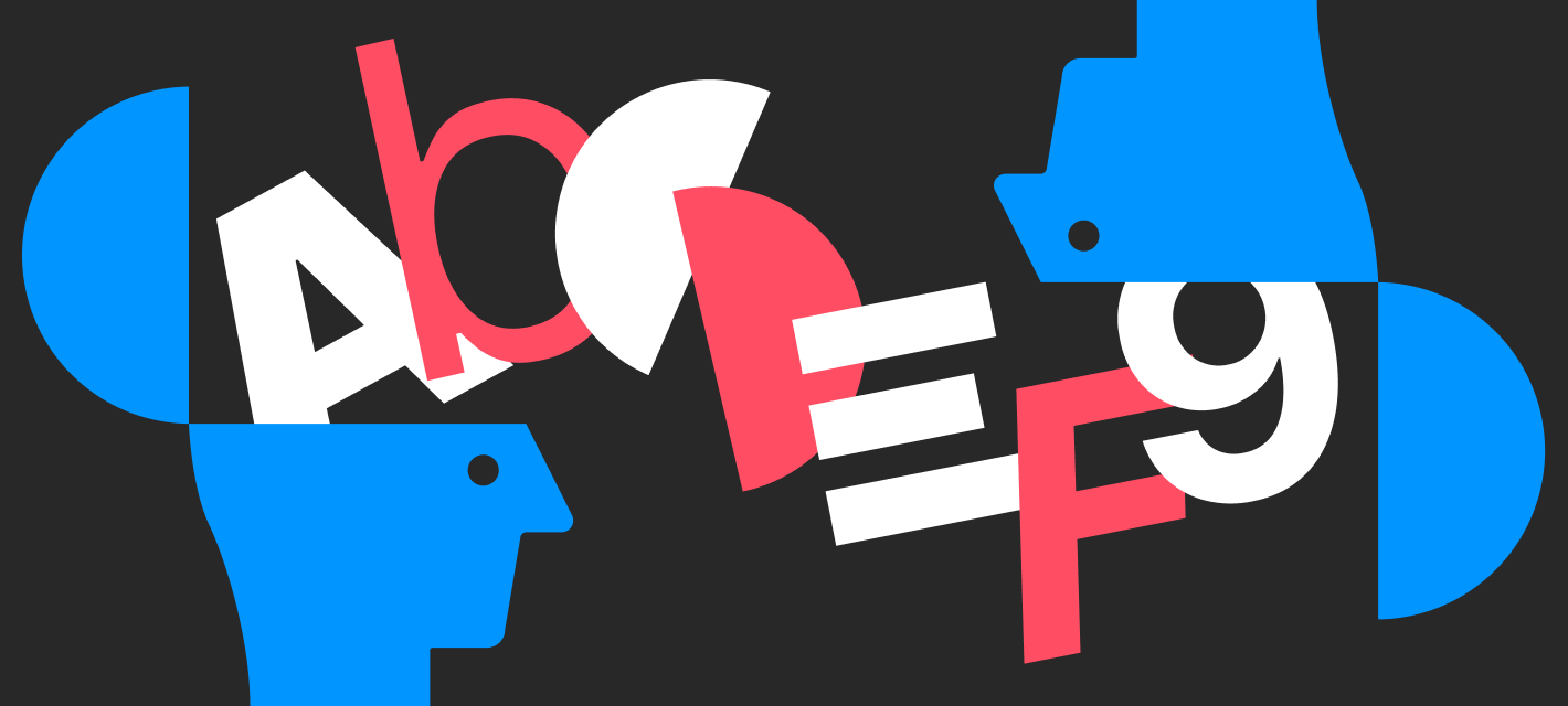
Get into good habits and spot the bad ones.

21. Design for good – Will Kinchin
As great as it is to have the opportunities to think and create for people, always make sure you ask yourself does the world need this project and could it harm anyone or the environment. It’s easy to get carried away in the excitement of the creative process and not fully consider the consequences of our actions.
22. Hashtags – Will Kinchin
You may have a brilliant name for your project or campaign but don’t forget to test out the potential web addresses, hashtags and handles. These two examples below made it all the way to our screens which goes to show even the best of us can miss these details.


23. Stay on top of the latest happenings.
Don’t let yourself fall behind the times of design and technology: they’re both fast moving industries. On the other hand, don’t go following the latest fads just because everyone else is. Keep up to date by visiting sites such as Smashing Magazine and DesignIsKinky, follow designers on instagram and twitter, and if you can buy some design or art focused magazines for inspiration.
24. Create a design system – Manifesto Studios
Create a checklist of all the things that need to be designed, and build a design system at the beginning. Think about it holistically and you’ll find you have repeatable modules and elements that create consistency and make your life easier, win-win. There are some great tools out there to help you with this. A personal favourite of ours is Design System Checklist, we used this when redesigning the GoSquared blog.
25. Keep to web standards.
It always looks like you mean business when your site is 100% standards compliant. However, some browsers still don’t always like to play ball. If it works and looks the same in all browsers then you have done your job. Make sure you test your designs across different browsers and different devices to make sure that nothing falls over when you view it on mobile.
26. Make a library.
In most programs, you end up reusing something that you once made a while ago. It always helps to keep a well organised library of all your reusable files. This especially applies when you’re working with Flash, where you can keep track of loops, buttons, timers, code snippets, and symbols. This centralised library can also help keep your work consistent which is super important if you’re designing for brands.
27. Give your designs room to breathe – Will Kinchin
Often clients may feel the need to fill every inch of a piece of design whether it’s a webpage, magazine spread or poster, after all they have paid for the space. This often leads to very busy designs where everything is fighting for attention. The result is very little gets communicated and the key message gets lost. The best way to get around this is by introducing some space. It breaks up information allowing you to introduce some hierarchy, It doesn’t fight for attention and it gives the whole design a little room to breathe.
28. Don’t overcook it – Manifesto Studios
Interactions are all the little details in the web experience – how things move when you move your mouse over them, how things animate in when you load your browser. They’re a great way to bring life to your designs in an interesting way and we are all for them but using interaction in web design is a lot like using Photoshop filters in print – proceed with caution! Cast your minds back to 2006 when Runescape, Bebo, MySpace were still a thing. Remember using Photoshop when you were 15 and how great it was using filters on everything – not good. Just because you can do something doesn’t mean you should and the same applies to web design.
Instead, think about interactions as an extra level of detail and finesse that enhances the site, not leads it. Make sure you plan these in early as possible in the process, it makes everything easier in the long run. Keep a bank of references for each page (essentially, a bibliography) you’re creating so you can easily sell your ideas into your clients or your developers with existing references instead of forcing them to imagine.
29. Save. Save. Save. Save again.
Are you getting the message? No matter how powerful your computer is, don’t leave yourself in a position where you could lose all of your days work in one flick of a switch. Sometimes it helps to have had a dodgy computer in the past, as I now save every time I leave the window I’m working in. Sometimes my Mac just won’t play ball, and the only option is a reboot. Don’t let a reboot ruin your day.
30. Collaborate.
We never let things go before we’re completely happy about the final version. Working together means you can share your ideas, but also give feedback to one another before finalising the design. These friendly, supportive criticisms can save you from harsher comments later on from your boss or client. Working together is also a whole lot more fun.
31. Understand the budget and audience. – Manifesto Studios
Understand your audience – this seems like an obvious one but a lot of the time designers and creatives don’t. Creating an experience online that’s wrong for the audience but right for your portfolio is a big no-no. People don’t engage, read and view content in the same way. Stop being a designer momentarily and put yourself in the shoes of your audience. Will they be in rush for key information? Will they know what they need as soon as they land on your site? Will you need to take them on a journey of discovery? Don’t frustrate them with a bad experience and don’t make them have to think by creating a seamless journey – Fulfill.Their.Needs.
Understanding the design and build budget is key.
Make sure you know this early on in the project. It’s all well and good creating a huge, immersive experience brimming with loads of detail that will be an obvious winner in the design community, but if there’s no budget to do it justice you will end up with a watered-down design that would make any creative cry.
32. Do it right first time.
It’s not always easy, but check check and check again. Your spelling, your colours, your file names. This sort of service is what a lot of clients will look out for when choosing someone to design (or redesign) their site.
33. Save your repeated actions
In a lot of applications you can end up doing the same tasks over and over again. For example in Photoshop you can save repeated procedures as “actions”. This can save you a lot of time and ensure consistency across you work.
34. Your assets’ greatest asset.
Keeping track of your assets can be a challenge, but it’s important you keep them how YOU want. Everyone has a different way of working. For example, when working on a site, I keep all of my full res and vector images in an entirely separate folder to the site, and when it comes to getting final composites ready for the web, I export at a compressed size to the respective folder of the site. One of the reasons why I like Illustrator so much is because there’s no need to worry about starting off at a large resolution, due to the vector based design. This is important in Photoshop, where it’s always best to start off big, and scale down when you need to.
35. Simplify.
Striving for simplicity may not seem too tricky at first, but when you have a wealth of ideas, it’s important not to complicate and distort your original message. If you are using a lot of complex visual elements, try to keep the colours simple, and vice versa. This way, your colours and design won’t compete with each other.
36. Stop at nothing – Will Kinchin
To James’s point about simplicity and knowing when a piece of design is finished… I think the French author Antoine de Saint-Exupery sums it up better than anyone. “Perfection is achieved, not when there is nothing more to add, but when there is nothing left to take away.”
I strive to achieve this form of perfection in my own work every day with varying levels of success. Sometimes things can get so simple and refined they look like they took five minutes to create as the design is so stripped back and effortless. These outcomes are usually the ones that take the longest, cause the most stress, but work the best.
37. Experience is everything.
The longer you have worked in design, the more experienced you become. Spending more time focusing on getting to know the applications you use can really speed up your production, making you more efficient and more knowledgeable.
38. Treat emails like a lesson in reduction – Will Kinchin
When communicating with clients, suppliers and colleagues try and craft and refine your emails to make them as clear, short and simple as possible. The last thing you need is a long chain of emails to sift through because you were unclear at the start and have caused confusion. This takes a touch longer but will save you heaps of time in the long run. This quote by Philosopher Marcus Tullius summed it up pretty well just before email was invented circa 100BC.“If I had more time, I would have written a shorter letter.”
39. Work with clients, not against them.
Your clients may seem to be the ones holding you back, but they’re the ones that you need to listen to. Think of them as the ones who will lead you to the starting post and get you off in the right direction.
40. Justify yourself.
If you want to make a statement, or do something a little differently, many clients will say outright “No.” Try giving them a persuasive and valid reason for the decision, however, and they may feel more inclined to let you go with it. This is why it’s so important to have meaning and strategy behind your work – it’s much easier to convince someone when you’ve got a strong ‘why’.
41. The Customer isn’t always right – Will Kinchin
Just because a client has asked for a flyer doesn’t mean that’s what they need. Question the client, question the brief, question everything. Become a toddler and keep asking “Why”. The more questions you ask the more likely you are to get to the real reason the client thinks they need a flyer. With your wonderful creative brain, you might come up with something much more engaging and impactful. For example a short film, an exhibition or even just a flyer (maybe the client was right after all) either way it is good to question.
42. Be iconic – Will Kinchin
Taking the last point to another level… In 1915, Coca-Cola issued a design competition announcement seeking “a bottle so distinct that you would recognize if by feel in the dark or lying broken on the ground.” It is a good practice to remember this brief when approaching any piece of design. It doesn’t just have to be a shard of bottle that is recognisably part of something bigger, it could be a secondary page on a website, an Instagram post forming part of a bigger campaign or even a simple 404 error message pop up. Everything is connected and if you cannot recognise who is communicating with you then the design is not working hard enough.
43. Don’t let the tail wag the dog – Will Kinchin
(I love this phrase, more for how it may look visually than for what it means) Sometimes we can get fixated on small details which we are wedded to but are not really working. To make them work we consider changing everything, when in fact we need to let them go. It could be a typeface choice that is great at a large size but illegible when smaller. Rather than changing typeface we consider making all the text really big. I am not saying big text doesn’t look good (the bigger the better in my opinion) but if this was for an annual report the client may cry when the page count and print costs rocket.
44. Embrace mistakes – Will Kinchin
I’m not saying upload a website with loads of bugs or send off a report with loads of spelling errors, but do allow yourself to make mistakes. Step out of your comfort zone, explore ideas and areas outside your skill set and push yourself. If things work out then halleluiah you learnt something and if things don’t work out then halleluiah you also learnt something. On some occasions a big old mistake may turn out to be a blessing in disguise, the term “Happy Accident” was not created on purpose.
Know your tools like the back of your hand.
45. Naming files.
Often overlooked, but naming your files in an organised and consistent way really helps you see how things have progressed, and what file belongs where. Never EVER attach “final” to a filename, because you will always go back to it and change it. Eventually you’ll have a folder full of twenty newer versions of that “final” revision. I have got into the habit of naming my work and putting “01”, “02” etc after it so I can see how many revisions I have made easily, and recall an older one to compare quickly.
46. Grids are the foundations – Will Kinchin
Whether designing a website, brochure or exhibition stand, always start with a grid. Think of a grid as the foundations of a house. Once you have your grid in place you can start to build your designs, confident that it will be solid, consistent and not fall to pieces.
47. Another layer of Photoshop Cake.
Always try to use as many layers as possible when working in Photoshop, avoiding merging them together. The worst thing possible is doing an amazing composition and thinking “actually, I think I’ll change that” and realising you merged those 2 layers. What’s worse is if you have gone past its history state, meaning even if you undo the last 50 changes you have made, there will still be nothing you can do!
48. Use a pen and paper.
In this day and age, it’s getting less and less common to use a pen and paper (I hope you remember what they look like). Try sketching a few images out and scanning them in. Bring them into Photoshop and play around for a bit. This can really help you build a more organic and original feel to your work.
49. Play with colour. Like no other.
After creating your image in Illustrator, or whichever application you use, try modifying the colours slightly by pulling it into Photoshop. This can really help you to unify the final colour of the composition.
50. Buy a new computer.
Call that a tip?! Well, it’s often forgotten, but the apps on the shelves today are getting faster and faster. To be honest, if your computer is more than 5 years old it’s time to consider an upgrade. Obviously your requirements are going to be unique: 3D animation is a whole lot more demanding than print design, but never the less, the faster your computer, the faster you can work. Many designers prefer Macs (I do), but PCs can run all of the applications that Adobe provide, and a few more. The PC vs. Mac argument is entirely up to you.
51. More RAM.
Just bought a new computer? Time to buy more RAM. Can’t afford a new computer right now? Buy more RAM. All the small jobs, like working on a couple of images, writing on your site, and playing back previews in Flash build up to devour any RAM you have. It’s as simple as this. Buy more RAM and you’ll be able to work faster.
52. Get more plug ins.
No matter which application you use, there’s almost always more plug ins available. Getting new filters and effects for Photoshop can greatly help you improve and speed up your work. Adobe’s own site is great for Photoshop plug ins.
53. Gradients in Photoshop.
To avoid the horrid “banding” that occurs when printing gradients in Photoshop, add a little noise to the layer. Obviously the amount of noise varied depending on canvas size and resolution.
54. Bring a little shade in.
Adding a few shadows, and darker areas can really enhance your work. These little touches can really create a flow in your work, especially if using vectors, as they bring a little smoothness to an otherwise sharp composition.
55. Add texture.
To give pieces a more organic feel, consider adding hand made gestures, and bringing a texture to your work. Don’t over do the organic additions, though, ultimately you should know when the work is complete.
56. Prepare yourself.
When working with motion projects and animation you need to be prepared. Compressing clips early on in a project will eventually grow into a noticeably poor quality shot. Don’t compress anything until the final cut, and even then, keep a full, high quality version somewhere safe. Just in case.
57. Be specific about what you can and can’t do.
Just ensure you are specific about what you are offering. If a client asks for something you are going to find difficult, make it clear that they will either have to give you more time, more money, or just leave it. Simple as that.
58. Do what you do best.
Don’t try to win clients who are going to demand more from you than you can offer. If you’re an amazing web designer, don’t go trying to dabble in professional 3D animation because it just won’t work. Stick to one thing, and show everyone else how awesome you are at it.
Embrace words, letters, shapes and space.
59. Typesetting – Will Kinchin
In a nutshell change as little as possible when differentiating between two type styles for use across a document or site. If the primary heading is 20pt and bold, make the secondary heading 10pt and still bold or 20pt and set in regular. Only change one thing. Change too much or add too many variants and the design will start to lose its consistency. Some of the best typesetting goes unnoticed, this means it’s doing its job well. People only tend to take notice if the brief is for the type to standout or if it has been typeset badly.
60. Think outside the screen – Will Kinchin
Responsive design is almost standard practice these days with apps and websites reformatting to fit all kind of screen sizes. You should also apply this logic to any piece of visual communication you may be designing. For example, you may have a beautifully illustrated intricate logo or campaign image which looks great on a big screen or billboard, but what about when it becomes a tiny profile picture on Instagram or even a 16 pixel by 16 pixel favicon? Now more than ever not only do our websites and apps need to fit the shape of our screens, our ideas, brands and marketing materials need to flex, morph and simplify to be recognisable and standout in almost any size imaginable.
61. Tonality – Will Kinchin
We have spoken a lot about design in terms of web, design, typefaces, ideas, and layouts however a massive part of design is the copywriting. From big punchy headlines to small explanatory copy it all needs to be considered. Firstly work out who you are talking to. For example, you would expect an ice cream shop to sound playful, warm (not too warm) and human, however a legal firm would be more functional, clear and knowledgeable. Develop a few rules / key words which can guide your writing style and help you keep your tone consistent.
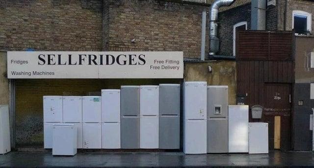
62. Play with words – Will Kinchin
Sometimes ideas are so simply wonderful you don’t really need much design at all. This image of this fridge shop in London needs no explanation.
63. Kerning – Will Kinchin
Who would have thought the simple task of spacing letters could go very wrong, “But the computer does it all for you doesn’t it right?” Wrong! For bigger projects like billboards and signage the layout of typography needs to be carfully considered and checked for legibility. Below are some funny examples where these checks have not happened.


Check check and check again.

64. How Long!? – Will Kinchin
When dealing with print, especially if you’re getting something made such as an exhibition stand, badges or uniforms always ask the supplier the lead time well in advance. No one wants to receive their promotional badge and name tag the day after the event. This will help you prioritise what needs to be designed first.
65. Stop. STOP!
Knowing when enough is enough is an essential skill. As time goes on you will get better at knowing when a piece is at its peak. Not every cake needs a cherry on top.
66. Never ever rely on the spell checker.
I really can’t emphasize this enough. Ensuring your text has no mistakes will not guarantee you more work, but letting work go out with mistakes will guarantee you being unpopular with your clients.
67. Ask your friend.
Get a friend or someone nearby to give their thoughts on your work. Even if they’re not a designer, it always helps to get another perspective on your work. They will likely spot things or ask questions that you won’t have thought about.
68. Take a break. Then stare until your eyes hurt.
Once you are nearing completion of a project, try taking a break, going outside, and looking at other things – anything, for a few minutes. Then come back, and stare at the project again, for ages, looking for anything that could be changed for the better. Specifically look for colours that could be made stronger or weakened in images. In sites, look for the simple things that you would assume are correct, like links.
69. Print finishes.
Once your work leaves the computer, it doesn’t have to stop having any creative input. There’s a whole universe of ways you can dramatically enhance your work in print that are just impossible when it’s on screen. For example, you could try using metallic inks, foil blocking, embossing, and die-cutting.
70. Keep a back up of everything.
Too often, I have lost files due to a disk error, or over written a folder by accident. These sorts of incidents are even more common with web design, when several members of a team have access to upload any files they want to the server. However, when running a site, you can also avoid loosing online files by ensuring everyone makes a copy of all the files on the server on a regular basis. You can even get scripts that will run a daily backup for you.
71. Do some Acrobatics.
If you have to send a piece of work for printing (gasp), check, double check, and triple check everything in Adobe Acrobat Professional. Things you should look for are overprints, spot colours, trapping, and knock-outs. Doing this simple step thoroughly will save a ton of time, and money.
72. Re re read.
Again, it’s all about checking. Especially when writing emails, for example, don’t fill in the address bar until last. Not only does this avoid accidental sending of an unfinished email, but it also forces you to write it in full, and to think twice before sending it. Re read your own emails at least twice. You can’t just “undo” a sent email. If only…
73. Proof read.
They always said so at school: check your work before handing it in. Always ensure you re read work, and then pass it over to someone else and then someone else again. Get as many people to read your work as possible, ensure it all makes sense, and you’ll be fine.
74. Return to the brief.
Once you feel you’ve finished, give the project back to the team. Ensure everyone likes (maybe that’s a strong word, shall we say “doesn’t hate”) it. This is where you need to evaluate whether or not it meets the original brief, and if you have kept closely to your original idea.
75. Stick to the brief like honey sticks to toast.
A lot of companies try very hard, in fact too hard to win a pitch, and come across to potential clients as desperate. Just ensure you do what it says in the brief, and no more. This way you will save time and money.
76. Never assume anything.
Too many times, people make assumptions and then kick themselves when it’s too late. For example, sending something off for printing, assuming the colours are all correct without a pre-print mock-up. Or, assuming everyone is on the same page to find out too late that you should have asked that obvious question.
77. Mum Test – Will Kinchin
A big part of our jobs as designers and communicators is to simplify the complex. With this in mind, everything I design has to pass the Mum Test. If she doesn’t understand what she is looking at, then many others will not either. After many years in the creative industry, I’m still being sent back to the drawing board by her blank expression. It doesn’t have to be your mum or any relative for that matter, just someone who’s coming at it with fresh eyes.
78. Be a good person – Will Kinchin
In the words of Anthony Burrill
“Work hard and be nice to people” It may now have become a design cliché hanging on the walls of trendy design studios and coffee shops and art colleges, but the sentiment is as true as it ever was.