It’s here. The all new design for Liquidicity. We hope you didn’t mind waiting, but we think it’s paid off. We went back to the drawing board and decided to rework the blog from the ground up. Before we waffle on, let’s get into the reasons why we decided to redesign Liquidicity.
A few things we noticed from the old Liquidicity
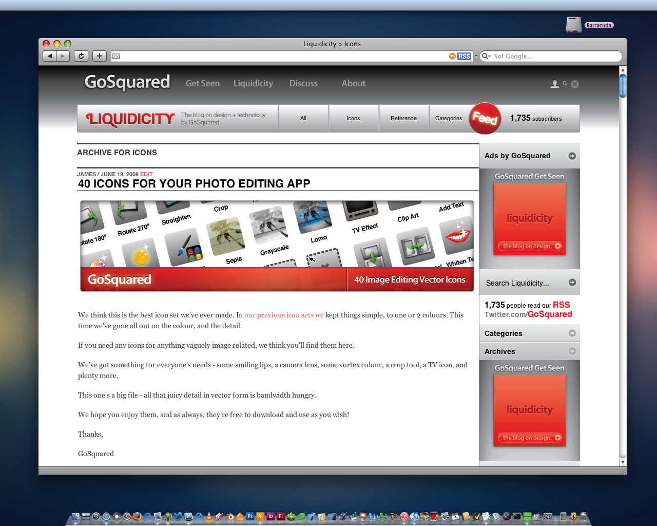
* People like our icons.
* People like our design reference posts – like Help Sheets.
* People want to be able to see what other posts we have produced without having to Google for them.
* We had a lot more people going to the site than reading our RSS feed.
* We never thoroughly looked at the Comments area before.
* We weren’t making it clear that Liquidicity was just one part of the GoSquared site.
* People often find it easy to search for stuff.
So we went ahead, and tried to design a better Liquidicity.
As a side note, you may be interested to know we’ve been working on redesigning the rest of the GoSquared site, so many of the concepts we’re playing with here on Liquidicity will soon be making their way across the whole site.
So what have we done? We’ve been very keen to clean up the many different areas of Liquidicity and form a more unified, easy to navigate interface, so we worked to a grid pattern (of 980px width) to structure the page. All navigation now falls strictly into the grid, from our subtly modified top navigation menu, to the Liquidicity navigation menu, to the sidebar, to the category and archive pages. We’ve tried to stick to the grid wherever possible.
Showing off the Feed
We broke the grid on purpose for the RSS badge in the Liquidicity navigation menu for obvious reasons – we wanted the element to stand out as much as possible. Trickier than it looks, but it makes sense. Along the same lines, with the aim of increasing awareness of our RSS feed, we are now showing the number of subscribers in at least two locations: the Liquidicity navigation menu and the sidebar. We didn’t want to use the ugly Feedburner widget, though, so we dug a little deeper and found we could use the Awareness API to pull our feed count from Feedburner’s servers without needing to show anything but pure text.
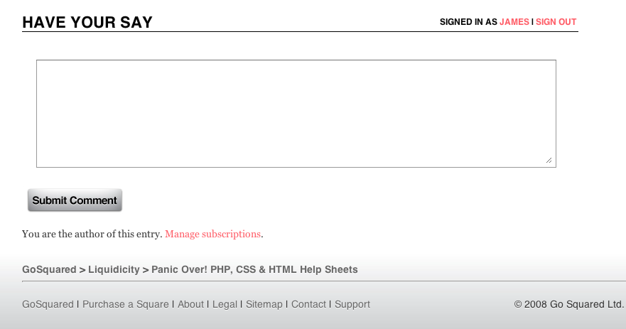
Comments that don’t suck
We wanted to improve the appearance of comments so we added Gravatar support. Now your Global Avatar will show up along side your comments on every post. We also ensured the actual form that members use to submit comments looked a bit better. We worked hard to design some new buttons that have multiple states so your click is rewarded with a grateful “active” state.
Down Below the Fold
A lot of time went in to improving the footer area of Liquidicity. We now show the (new) global GoSquared footer, along with a breadcrumb trail to help you find your way in the navigational structure of the blog. Further helping navigation, we have made some new buttons (in the style of the comment submit button) for browsing back and forth in time through the list pages of posts. Again, we hope these will encourage people to further explore more content on Liquidicity.
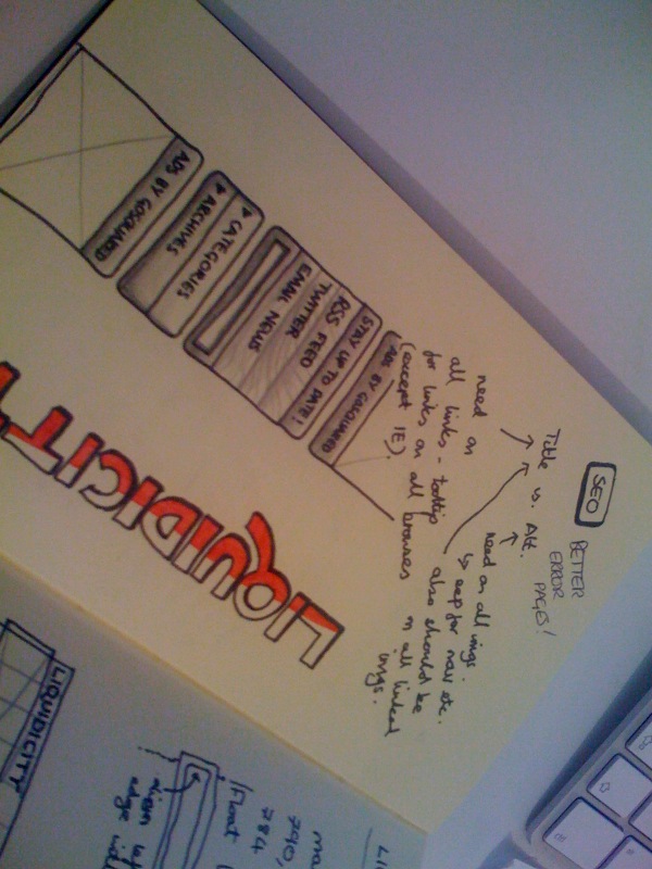
All in all, we hope you like the new Liquidicity. Have a quick look through the images in the gallery below to see close ups on what we’ve done, and a few sketches we made when planning the new design.
As always, design gets better with feedback, so we would love to hear your thoughts on the redesign.
Thanks!
The GoSquared Team