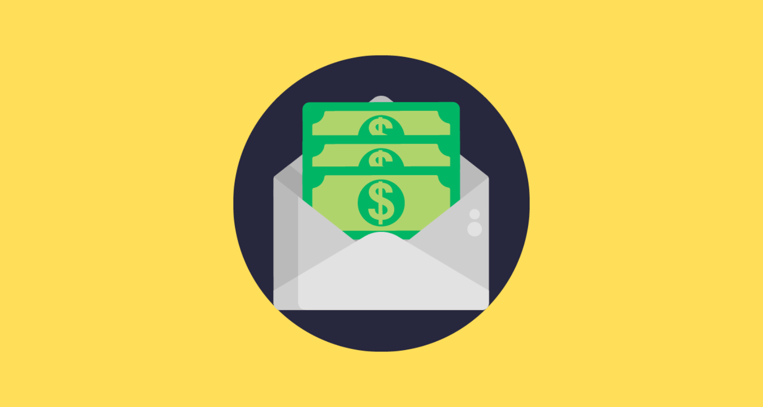
Email marketing is said to offer the highest ROI but what happens when your campaigns fail to deliver results?
Regardless of how ‘content-rich’ your email newsletters are, if they don’t capture attention and engage subscribers, it certainly calls for a change in strategy.
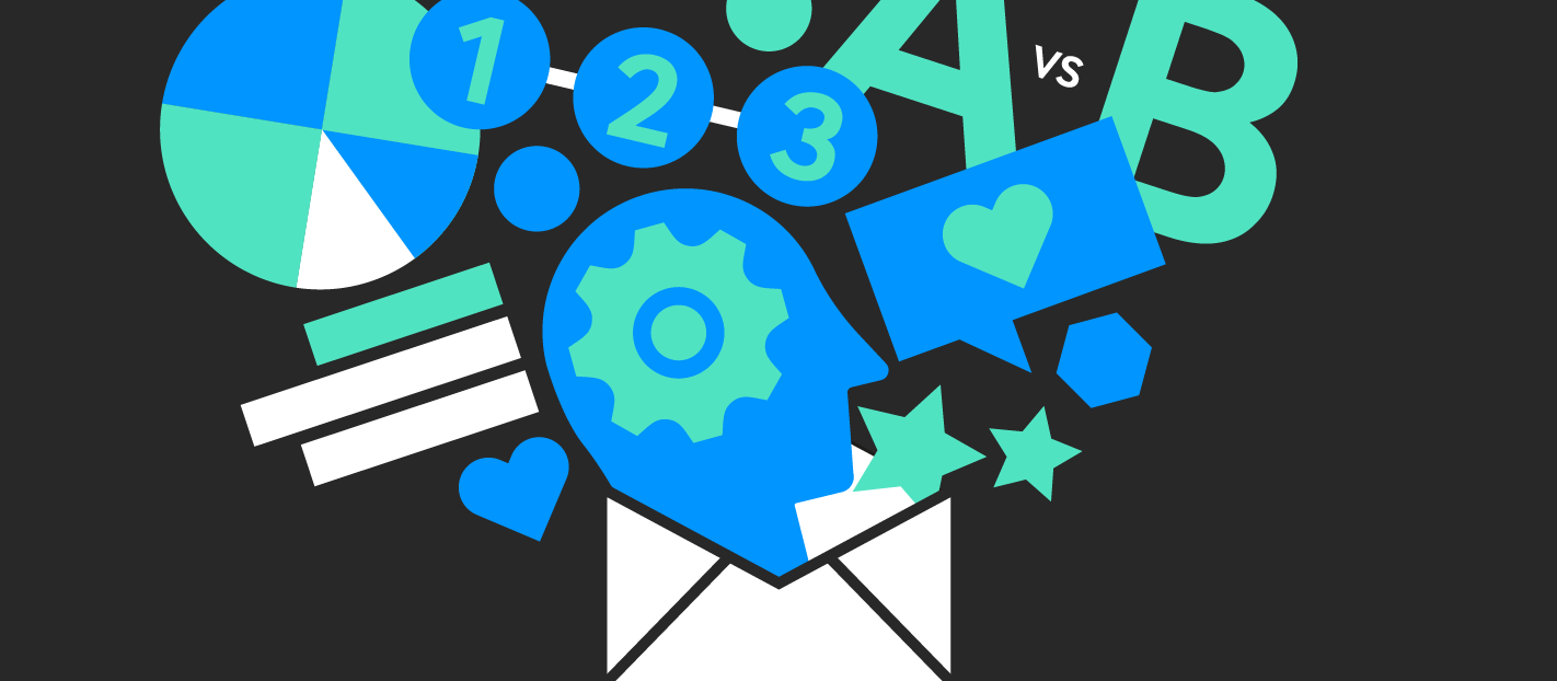
One of the ways to stand out in a crowded inbox and get your audience to read your emails is by incorporating infographics in email newsletters.
Apart from enhancing visual appeal, email infographics effectively communicate the message and explain complex concepts without overwhelming the reader. They present information in an easily digestible manner while driving engagement and traffic.
Here are six surefire ways to use email infographics and boost subscriber engagement.
Educate your audience

Educating your audience with quality content goes a long way in creating brand awareness, driving traffic and generating sales. While creating educational content is not new, what’s important is how you decide to present that information.
You can choose to write lengthy paragraphs of text or convert it into mini infographics and increase its chances of getting read.
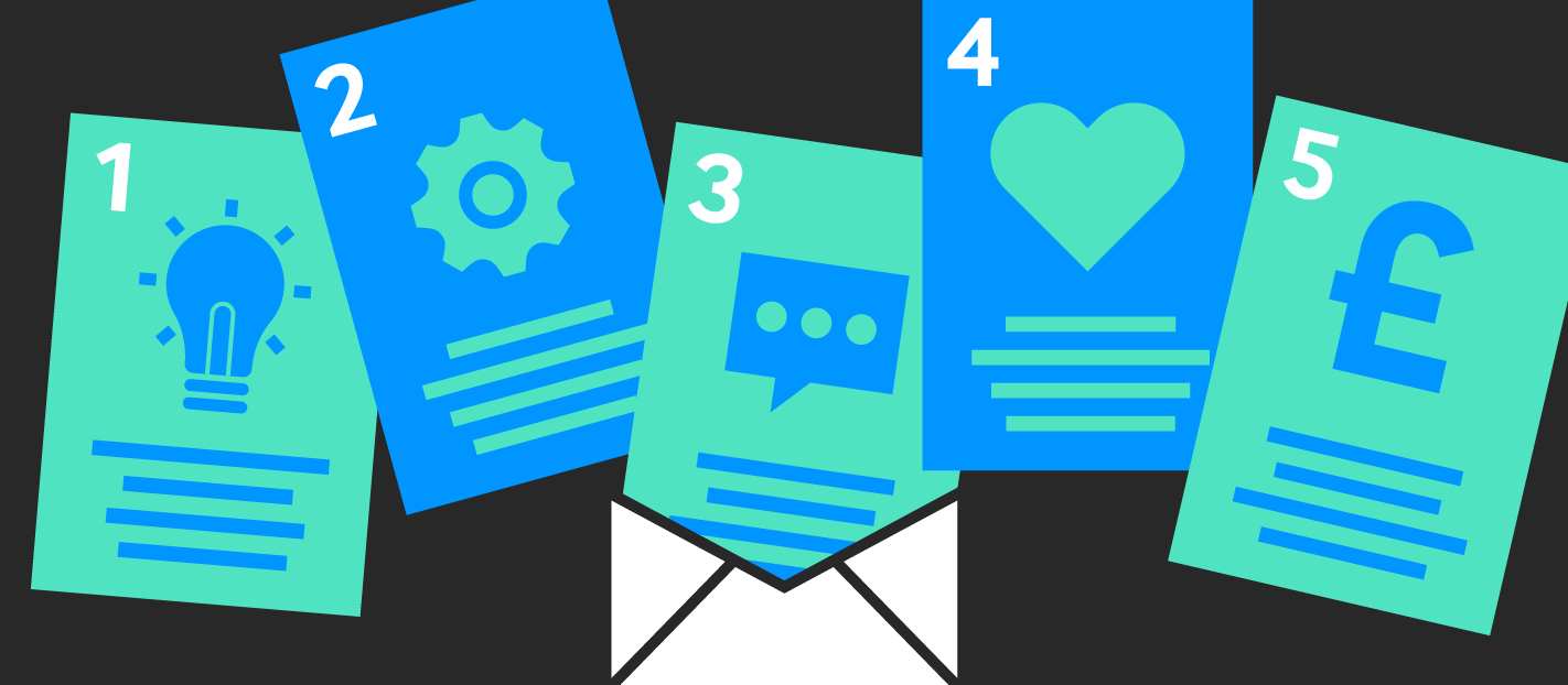
From demonstrating product features and sharing tips to showcasing a tutorial or how-to guide — there are various ways to use email infographics to educate your audience.
Here’s a snippet from a newsletter by hers that lists the benefits of a product using infographics.

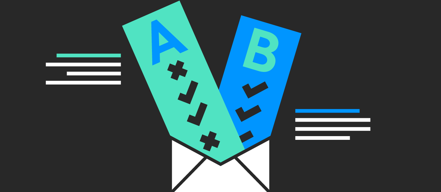
Compare two concepts
Remember — your audience is looking for answers and offering content that helps them make their minds up is always a good idea.
Including a comparison infographic in your email newsletter is a smart way to illustrate comparisons, enabling subscribers to visualize the information and decide what works best for them.
Here are the different ways you can use comparison email infographics:
- Highlight pros and cons
- Compare two different products (or concepts) while highlighting their features
- Lay out the various options on a comparison table
- Debunk myths
While creating comparison infographics, make sure you pick the right color scheme to aid comprehension and influence decisions.
Tell a story through sharing data
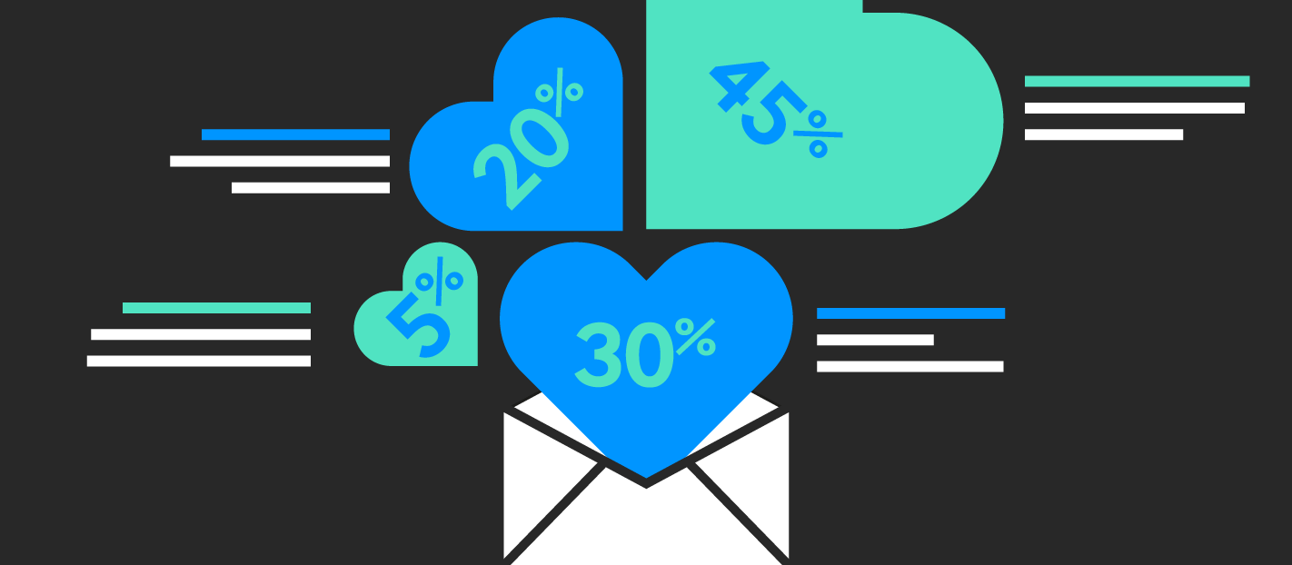
Let’s face it — data on its own makes for a boring read. It rarely manages to retain people’s attention and may also tend to be overwhelming at times.
However, if you know how to tell a story with data, it can prove to be a powerful marketing tactic. The key lies in choosing the right data visualization tool.
So, if you’re looking to share data in newsletters in the form of user stats or company milestones, consider using email infographics to present that information and capture interest.
Here’s a good way to share data using email infographics, as seen in a MileIQ newsletter.

Highlight a process
No matter how straightforward or complex a process is, it helps to use a process infographic to take the user through the various steps. This lets the reader visualize the journey better without getting confused.
A good use case is including a process infographic in a customer onboarding email to take them through the user activation process. Not only does this incite action but it also boosts engagement.
To create a process infographic, start by breaking down the process and using icons or illustrations along with crisp copy to complement every step.
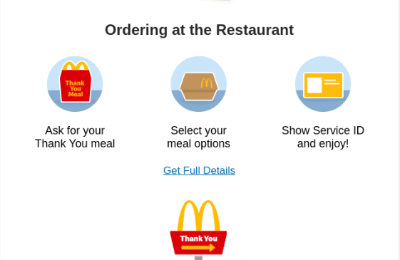
Here’s an example from one of McDonald’s newsletters which highlights how first responders and healthcare workers can avail a free ‘thank you meal’.
Share chronological information

Let’s say you want to throw light on your company’s evolution, showcase an event schedule or demonstrate the user’s weekly progress in one of your email newsletters. In such cases, you can use a timeline infographic to present that chronological information in a visually engaging way.
Timeline email infographics help readers digest the important points and retain information while remaining engaged.
Start by creating an outline with the different events and dates you’re laying out. Use distinct colors to make the various elements stand out while using a mix of icons and brief descriptions.
Here’s a snippet from one of Segment’s email newsletters which lays out an event timeline.

Offer social proof

In a sea of branded content, customers are always on the lookout for authenticity. It’s no surprise that the average consumer reads 10 reviews before making a purchase decision.
Considering its influential power, brands must leverage social proof to build trust and a smart way to do that is by integrating social proof in email newsletters. Here are the different types of social proof you can include:
- Customer reviews and testimonials
- Curated user-generated content
- Noteworthy company statistics
- Case studies
- Best-sellers or customer favorites
- Media mentions
- Awards and achievements
However, it’s not enough to include social proof in your emails. You need to make it appealing and what better way to do that than through the use of well-designed email infographics.
Here’s an example of the use of infographics to present social proof from a CARE Australia newsletter.

Boost engagement with email infographics: the takeaway
From segmenting your list and choosing the right email marketing tool to creating personalized content — you might be doing everything right and still not see results.
Remember — your subscribers receive several emails in a week. Whether your newsletter is one of those that gets read truly depends on how valuable and engaging the content is.
So, strengthen your email marketing strategy by leveraging the power of infographics to visually communicate information and boost subscriber engagement.
Simki Dutta is a content marketer at Venngage, a free infographic maker and design platform. When she’s not working, she can be found refreshing her Twitter feed and binge-watching Netflix shows. Find her on Twitter and LinkedIn.