We have had a busy week of GoSquared updates.
Time for a good old fashioned liquidicity classic: What you can do with type, and a little imagination.
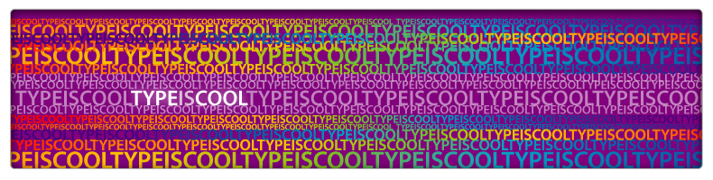
Above, the same phrase has been copied over and over, with the point size changed. Colours have then been applied, with gradients flowing from left to right to merge the phrases together. The phrase that stands out does so due to its sharp change in colour.

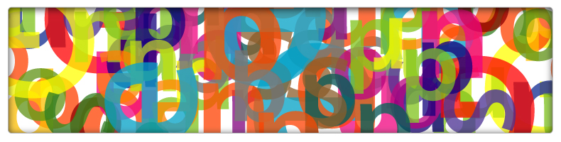
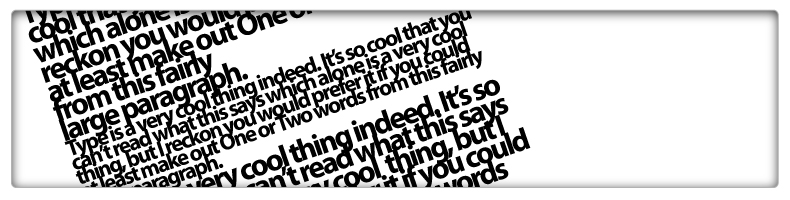
Here, a single word or phrase is duplicated many times and rotated by varying degrees. Using a larger letter-form as a template, the smaller individual words are placed inside to form the same shape. The larger letter is then removed to leave the individual words on top of the repetitive background. Groups of words can be moved and rotated to speed up the process.
Above, the letters form the composition based upon colour. Each letter has been converted to a vector path and filled with a single colour. The opacity of each letter has been altered to allow colours to interact.

Here, a path has been drawn out with a vector pen tool, and the text then forced to follow the path. This creates a fluid shape when the path is curved, and works best when multiple colours are employed.

Letters can be replaced by symbols. When every symbol is the same shape, they can be differentiated only by colour. Choosing colours to represent letters and other characters can lead to a very intriguing pattern. The brain still tries to make sense of the pattern as it understands the recognised metaphors or paragraph indents and ragged lines.

This is just annoying. The meaning of the word has been removed by striking through each line of text with a block of colour. The viewer is drawn in by the confusion and then frustration at not being able to work out what the text is trying to convey, while being stimulated by the pattern of colour and form.
Here, the individual letter and word spacing [kerning and tracking], and the space in between lines [leading] has been taken to extreme levels. The words and meaning of the text become less important than the textural effect.
So, there’s a few examples of extreme text effects. Got any of your own you’d like to show? Drop us a comment below.
You might also like: 165 Vector Icons in 5 Colours, 77 Vector Buttons, 50 Ways to Become a Better Designer