Whether you’re selling software or sausages, your website navigation must make the journey as smooth as possible for your users. Get your website navigation wrong, and it could spell disaster.
Every website out there has some form of navigation, and there’s often a lot of questions about how to approach this critical aspect of web design.
In this post we’ll take a look at some key lessons learned from designing our own website navigation over the years, and share a few examples from some of the best sites out there.
All of which is designed to help you make impactful changes to your website to supercharge those all-important clicks and conversions.
Website navigation: An Overview

Website navigation encompasses every aspect of how users interact with your website. From scanning through menus to clicking on call-to-action buttons – website navigation helps your users to get around easily. In turn, the idea is that your business goals are more likely to be reached, because the journey from A to B has been made to feel as natural not to mention as convenient as possible.
The simple fact is that if your website isn’t easy to navigate, users won’t hang around. If a website has a high bounce rate, impressions, visits and conversions will all be affected. Therefore, it’s essential that as a website owner, or a website designer or developer, you understand how to nail your website’s navigation.
Website navigation terms
- Breadcrumbs
- CTA (call-to-action)
- Dropdown menu
- Footer
- Header
- Homepage
- Hover state
- Link
- Megamenu
- Primary navigation
- Search bar
- Secondary navigation
- Selected state
- Sidebar
#15 website navigation best practices & worst mistakes to avoid

Ready to find out how to best facilitate conversions on your website, and which deadly web design sins to avoid? Here are our best and worst website navigation practices.
#1 – Do define your information architecture

It’s easy to jump into chucking links in a line at the top of your pages before you’ve fully considered the structure of your website.
Starting at a high level and thinking about the overall information architecture of your website is important to give your navigation a hierarchy and ensure you don’t forget important links that may be overlooked.
In larger companies, it’s easy to jump to the assumption that the the website should follow the way the company is structured, but this is a dangerously non-customer-centric approach to information architecture.
Instead, try a technique called “Card sorting” with as many stakeholders as you can – with your team, your friends, your family, and most importantly, your customers.
There are two key types of card sorting:
#2 Open card sorting
Open card sorting is when participants are given cards containing the content you need to organise, and are asked to categorise them entirely independently. Participants aren’t given any information beforehand, and they are responsible for naming the groups.
This is the most appropriate technique if you’re approaching a new website, without an existing structure in place.
#3 Closed card sorting
Closed card sorting is just like open card sorting, except participants are given the categories to put cards into, as well as the content to sort. Participants are not responsible for naming the cards, so this technique is handy if you have an existing website with established categories and core concepts.
Smashing Magazine has a great article on using card sorting to improve your information architecture.
#4 – Don’t reinvent the wheel

There are many well-trodden paths for website navigation.
Knowing when to break the rules is important, but for the most part it makes sense to stick to the basics and avoid rethinking the rules just to be different.
It sometimes can be tempting to design navigation with the goal of getting noticed, and being featured for a fancy web design award, but more often than not the best website navigation just works – it doesn’t shout for attention or have crazy shiny animations.
#5 Keep navigation at the top

You can obviously place your navigation anywhere – top, bottom, left, or right on the page.
Almost every time, it makes sense to keep your navigation at the top of your pages. The top of pages is the first thing your visitors see, it’s where their cursor is already positioned if they’ve been entering a web address or search term with their browser, and as with many recommendations in this article, it’s also by far the most common and well-understood place for navigation to be located.
#6 Put your logo in the top left
In the same vein as putting your navigation at the top of pages on your site, it’s common place to put your logo in the top left of your site.
Not only should your logo take visitors back to the homepage (more on that in a moment), but the top left is usually the first part of the page a visitor will naturally see first. Over centuries of reading written words, we’ve always been trained to read left to right, and top to bottom, so it makes sense for the logo to be the first thing you see on every page of a website.
#7 Make your logo clickable
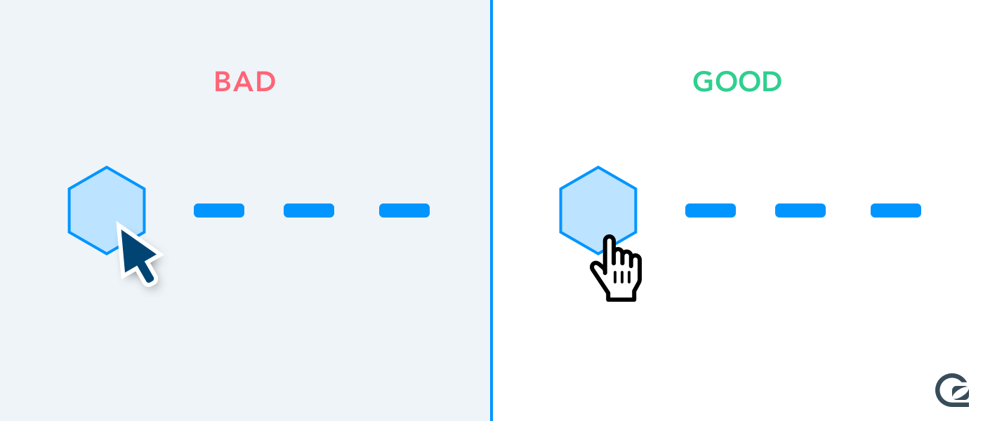
Placing your homepage link in the top left is logical because desktop browsers place their back button just above this location, so assuming your visitors are already used to hitting their back button (we’re will to bet they are), then placing your homepage link in the top left is a no brainer.
Aside from the back button, Mac users will also be used to hitting the “Close window” button in the top left, so there’s a natural sense of “to get out of what I’m doing, I move my cursor to the top left of the screen”.
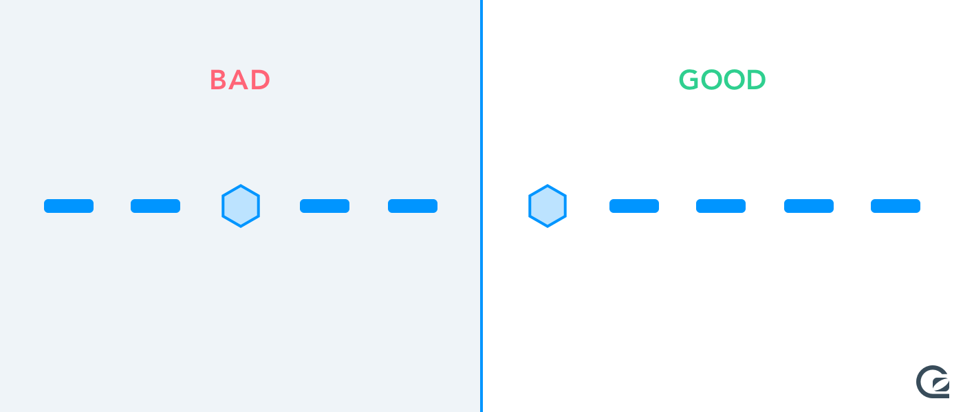
#8 Order navigation items based on importance
This might sound obvious, but it’s often overlooked – ensure you prioritise your most important and helpful pages as high as possible in your navigation.
Defining your “most important” pages is always a challenge, but a good place to start is to look at the most popular pages already on your site and to understand the reasons why people are going to those.
A little plug for GoSquared here, but you can use Live Chat Prompts to understand more about why visitors are going to specific pages of your site, and go beyond just the numbers.
#9 Carefully choose when to use drop-down menus
Drop-down (or popover) menus are a good way to enable visitors to discover a large number of pages in a small amount of space.
Drop-down menus enable you to consolidate a bunch of links under one top level heading, and can be shown by hovering or clicking on the heading.
Drop-down menus seem to be showing up on an increasing number of sites as they become easier to implement with just HTML and CSS – there’s no need to use horrible old technologies like Flash, or even JavaScript any more to implement drop-down menus in most modern browsers.
For those more technically inclined, we recently wrote about how to build a semantic, responsive website navigation in just HTML and CSS.
A few things to watch out for with dropdown menus:
- It’s often hard to see whether visitors need to click or hover to bring up a menu. Our advice here would be to show the menu on hover, and allow the visitor to click without taking them to another page.
- Drop-down menus can become a little unpredictable on touch devices, especially devices with small screens.
- Use drop-down menus sparingly, and with clear, unambiguous headings on desktop to avoid reproducing the common issues of burger menus – more on that next.
#10 Don’t hide behind a burger menu
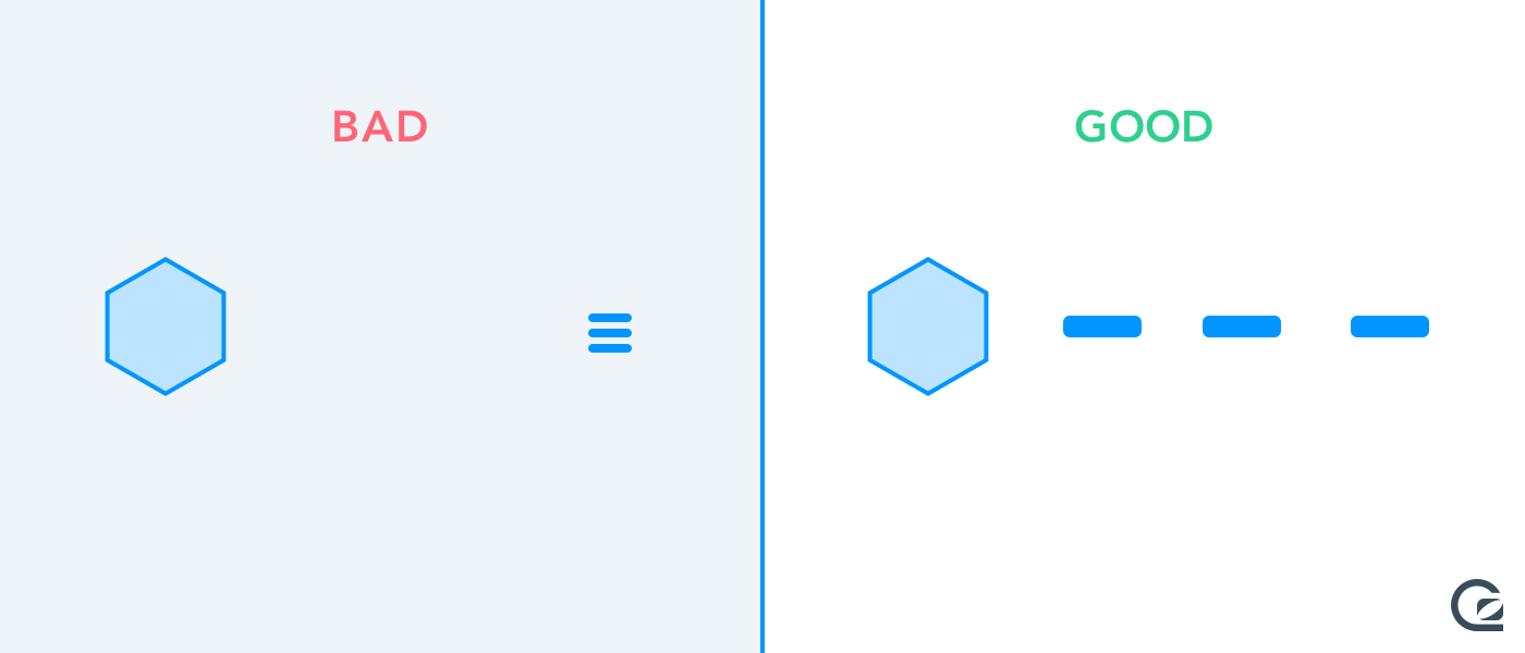
The burger menu is a tried and tested technique to condense navigation into just one small, easy-to-place element.
Burger menus are an acceptable way for many websites to condense a large navigation system on mobile devices, but it’s hard to understand the justification for using such a technique on desktop websites.
The downside of using burger menus is they hide all the links behind just one icon. They fail to give the visitor a hint or understanding of the global structure of the site until the button is clicked. On desktop you have all the space you need to at least show a handful of links without needing to hide all the clutter away.
Burger menus on the desktop may give the visual appearance of simplicity, but make the browsing experience more complex for the visitor.
#11 Pick a primary global Call-to-Action button

Most SaaS websites have a primary Call-to-Action – often it’s to start a trial, or to book a demo with the sales team.
Ensuring this CTA is consistently in the same position on all pages of the website, with the same copy and the same appearance will undoubtedly ensure visitors know where to go if or when they decide the product is right for them and want to make their first commitment.
The website navigation is obviously not the only place for a Call-to-Action, but the navigation can act as a reliable, consistent place to go wherever you are on the website.
A popular place for the CTA is the top right – you see this on many SaaS websites, but also on popular ecommerce sites. Everyone knows you hit the blue “buy now” button at the top right of a page on Apple.com to exchange your hard-earned dollars for a new shiny piece of aluminium and glass.
Check out our extensive guide for more information on how to create effective Call-to-Action buttons (CTAs).
#12 Integrate search into your website navigation

Search can be a hugely valuable feature for website visitors, but it can also be a source of learning for you as a website owner.
Visitors can always head to a search engine like Google or Bing to find something, but sometimes they’re already on your site and trying to find a specific product or page like a support doc.
Use site search to help your visitors help themselves, but ensure it’s easy to access and available consistently throughout your site to avoid confusion.
Tracing basic metrics on your site can also give you a ton of information about how to improve your own navigation and naming conventions.
A few examples of how site search can help you improve your website navigation:
- Find top search terms that visitors are trying, but that have no pages or products – these are likely great products to stock, or pages to create.
- Find the phrases visitors are typing to get to existing content – are they using different terminology? Perhaps you could rename your existing pages or products?
- Are visitors searching instead of using your navigation? This could be because search is faster for them, or the navigation is confusing or broken for them.
#13 Consider your website footer in conjunction with your top level navigation
You don’t need to place every link to every page on your website in your navigation bar at the top of the page. In fact, if you try to place every single link in your website navigation, you’ll probably end up in chaos.
Instead, think about how you can use your footer and navigation in conjunction with each other to enable visitors to get to where they need without having to head back to a Google search.
A few handy tips here:
- Try to keep high level categories or areas of the site consistent between your top navigation and the footer wherever possible.
- Some websites use their global footer as a sort of sitemap. Don’t chuck all your links into the footer without categorisation and hierarchy.
- For sites with huge numbers of pages, try customising your footer for each core section of your site, while keeping the global navigation global.
- Using a breadcrumb trail in your footer to help visitors understand where they are in the hierarchy of your site.
- It never hurts to repeat your primary CTA in your footer.
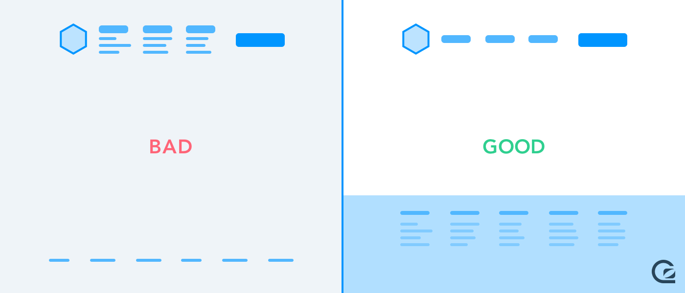
#14 Two-tier website navigation

Sites that have huge numbers of pages will often adopt a secondary navigation bar to offer a series of links to other pages on the site.
This is a good tactic for separating content-related links from other product and company related links, for example. The downside of this approach is it can be overwhelming, and doesn’t translate to mobile well.
Visually differentiating these two tiers of navigation is important, so ensure you at least use different shades and font sizes to emphasise the primary and secondary navigation.
#15 Design your navigation for both mobile and desktop – responsive web design
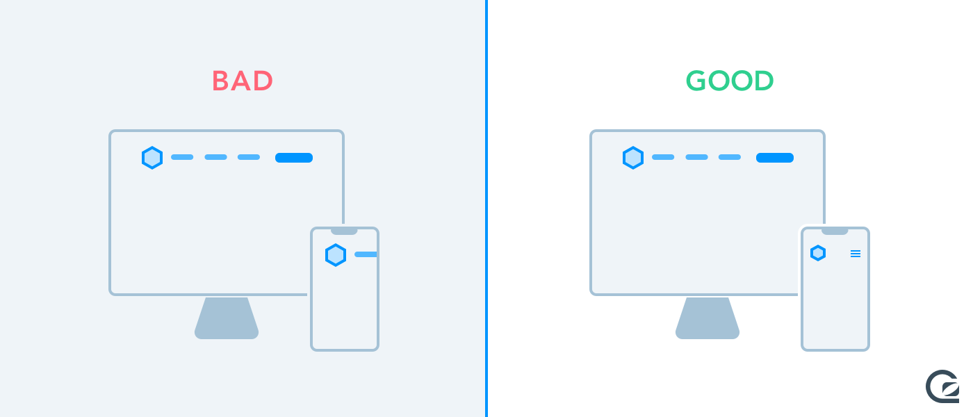
Designing website navigation is just half of the story – thinking about how visitors navigate your site on mobile is more important than ever.
While some sites choose to direct visitors to download and install a native app instead of using their website, there’s always going to be a significant number of people who will choose to view your site on their mobile browser.
Here’s a few tips for ensuring your navigation works well on mobile:
- Ensure your “tap targets” (the amount of space for a link) are large enough that someone with big thumbs can easily hit each link in your navigation. Don’t make it too fiddly!
- Think about what mobile users could be looking for – they’re not necessarily the same requirements as desktop users.
- The attention span of mobile users, and the context with which they’re using your website, may be very different to that of a desktop user – ensure your navigation is as simple as possible (but not simpler!), and fast to use.
- You don’t necessarily need to show all the links you show on desktop on mobile – be selective based on the needs of your mobile users.
- Burger menus are a lot more acceptable on mobile than on desktop, but extra points go to sites that manage to avoid them.
20 examples of excellent website navigation
We obviously don’t know how well any of these sites perform from a business perspective, but we’ve picked out a few great examples of website navigation from around the web – chosen by us as visitors and users.
Amazon

We’ve all heard of Amazon, but they’re listed here because their navigation has to deal with a huge number of challenges – they have millions of products to list and categorise, they have an increasing number of departments and services, and they have a huge and diver base of customers.
The navigation on the Amazon site is extremely fast and easy to jump around; it’s well ordered and categorised; and it’s backed up by a huge and effective search experience to get you where you need to be fast.
Check out Amazon’s website navigation
Apple
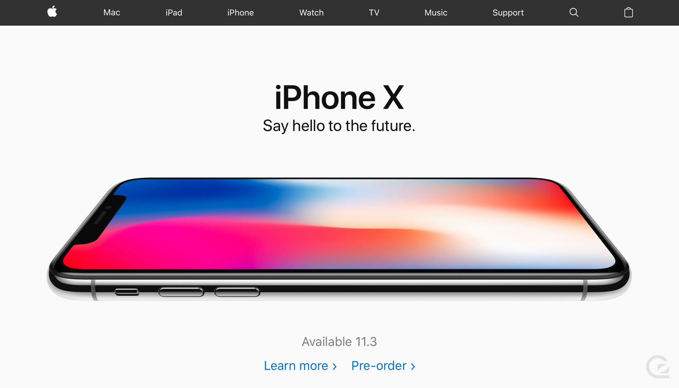
Apple’s site is vast, and contains thousands upon thousands of product pages, company information pages, and support articles, but they’ve condensed it down into a beautiful and simple navigation bar with an easy-to-scan number of links.
The site is categorised by product areas, which each contain landing pages to direct you off to specific products. Apple also relies on search heavily to drive you to niche pages such as specific support documents.
In addition, Apple’s website navigation works well on mobile – it scales down and still animates in smoothly, and the tap areas are generous enough for most fingers and thumbs.
Check out the navigation on Apple’s site
Atlassian

Atlassian’s family of software products is growing all the time, and their website navigation breaks each product area down in a logical way. Coupled with bright new icons, the Atlassian website navigation makes a complex bunch of tools dramatically easier to understand.
Baremetrics
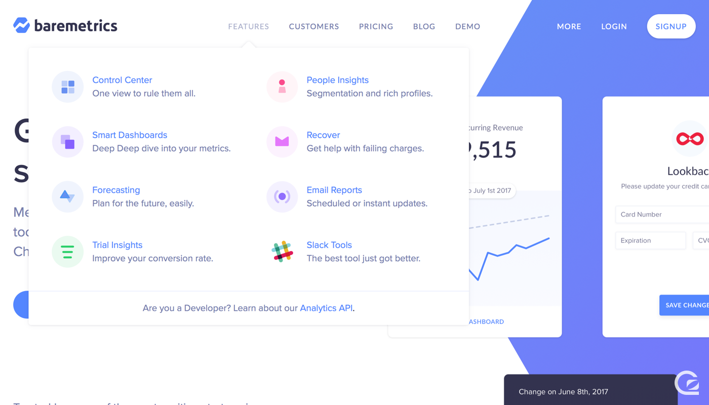
Baremetrics recently redesigned their site and introduced a beautiful new aesthetic with bright new icons and a refreshing colour palette. The new site introduced a drop down navigation system that allows you to jump to feature pages in a single click.
Check out the Baremetrics website
Basecamp

Basecamp’s site is simple and easy to navigate. They’re listed here because they’re often a go-to source of inspiration for aspiring B2B SaaS businesses, and their one line of links proves your navigation doesn’t have to be crazy or shiny to be successful.
Casper

Casper sell mattresses online. They’re an increasingly popular brand, and they’ve always shown care on their website, especially as their product lines have grown. The latest version of the Casper site introduces a simple drop down menu on a few product categories so you can jump to a product page easily.
DigitalOcean

DigitalOcean have a huge array of technical services and options, but they’ve condensed an otherwise complex array of pages into a simple and elegant navigation bar. They’ve also clearly differentiated their primary CTA of “Sign Up” with a bold dark blue button on the far right.
Dropbox
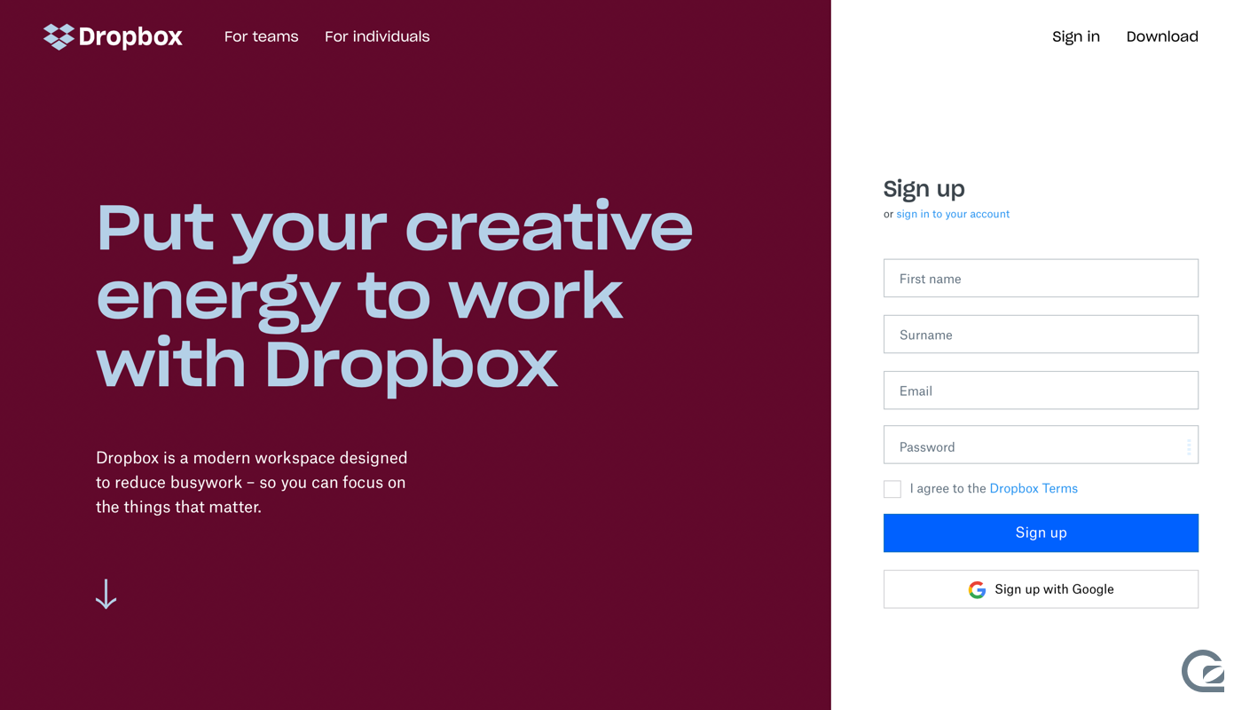
The Dropox brand recently got a major visual overhaul – some love it and some hate it, but it’s an interesting site to look at nonetheless!
Dropbox certainly breaks from convention with their homepage design, and has a sparse navigation with just a few links. The action buttons are on the right as one would expect, but are also visually differentiated by the bold background colours.
Framer

Framer is a prototyping tool for designers, and they’re always iterating on their public marketing site. The latest version of the Framer site features a few dropdown so you can quickly jump to key pages from anywhere. We love their primary CTA for featuring a bold blue button coupled with a lovely little icon to infer the action you’re about to take.
GitHub

GitHub’s navigation is extremely simple and heavily features a search bar to get you to the interesting stuff – the actual code! They’ve strictly stuck to a grayscale colour palette but have used a number of shades to effectively differentiate the prominence of text.
View GitHub’s website navigation
GoSquared

Of course, this is us. We’re proud of the navigation we have on the GoSquared site, but perhaps a more useful thing to mention here is our post on how we implemented a beautiful drop-down menu system without using JavaScript just using HTML and CSS.
View the GoSquared website navigation, and see how we built the navigation system.
Hubspot
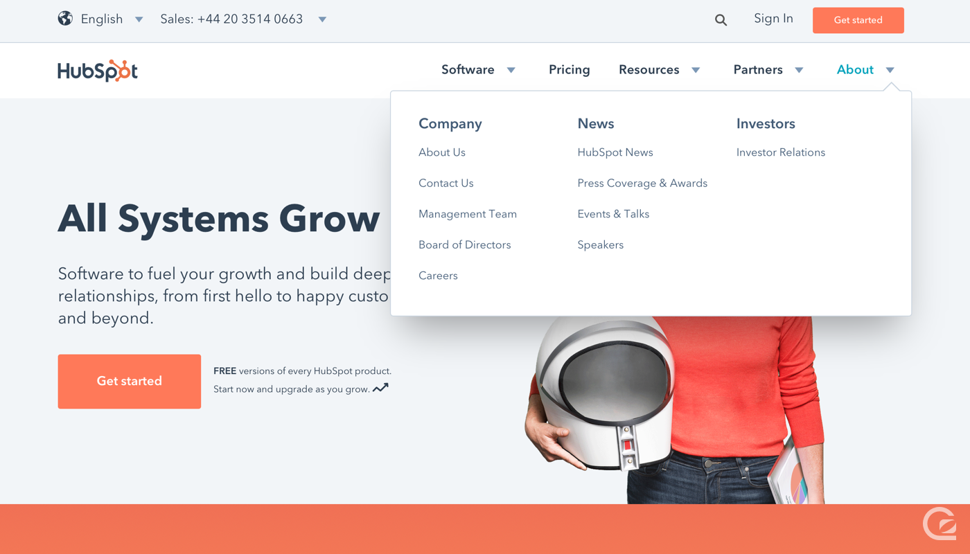
Hubspot recently updated their site to remove one of their secondary navigation bars. The current site features a series of drop down menus, but also keeps the primary CTA in a bar above the primary navigation links.
MailChimp
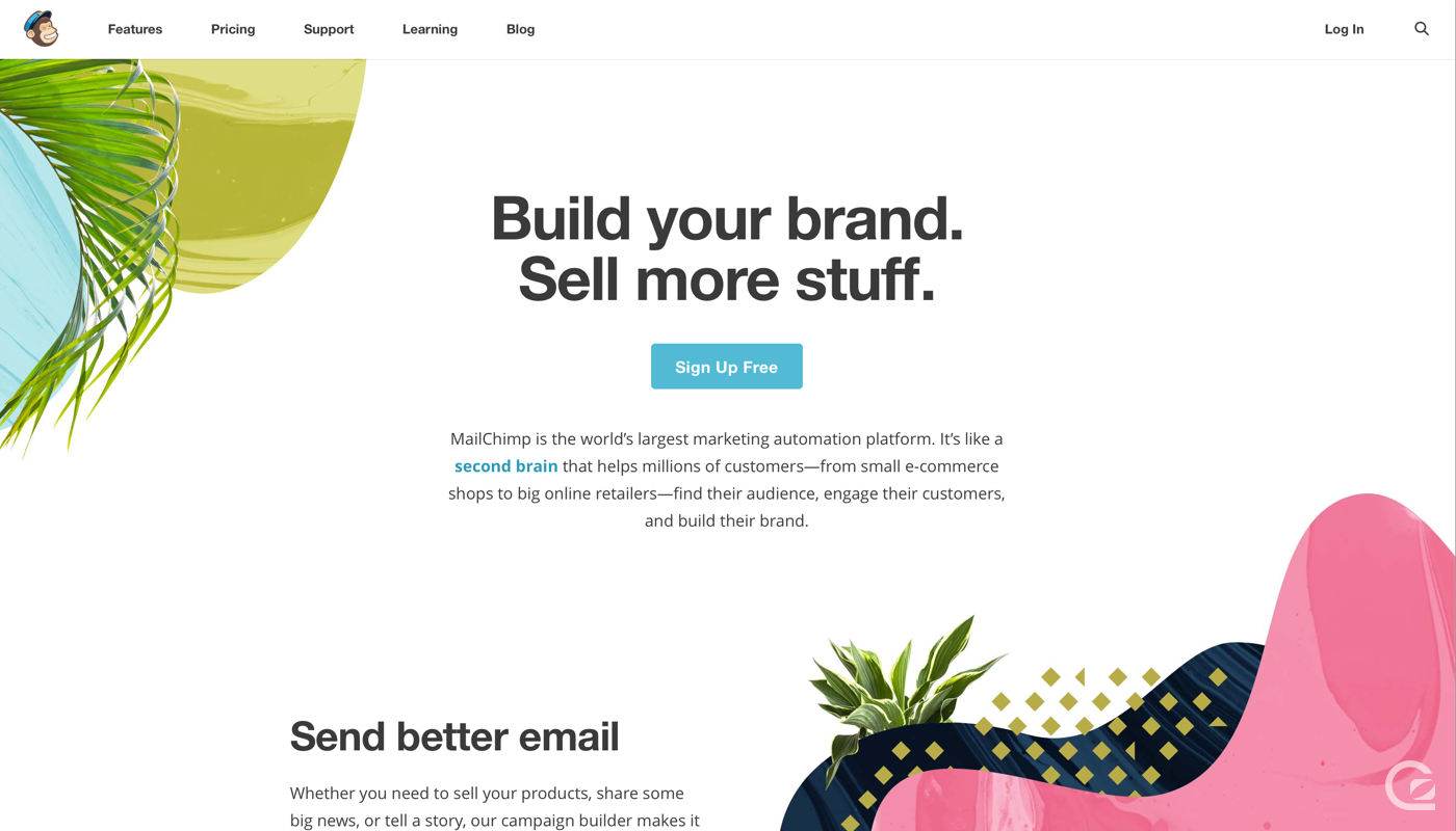
MailChimp’s site navigation is another example of simple, clean, focused links. There’s nothing fancy here, but it’s clear and obvious. A place for everything, and everything in its place.
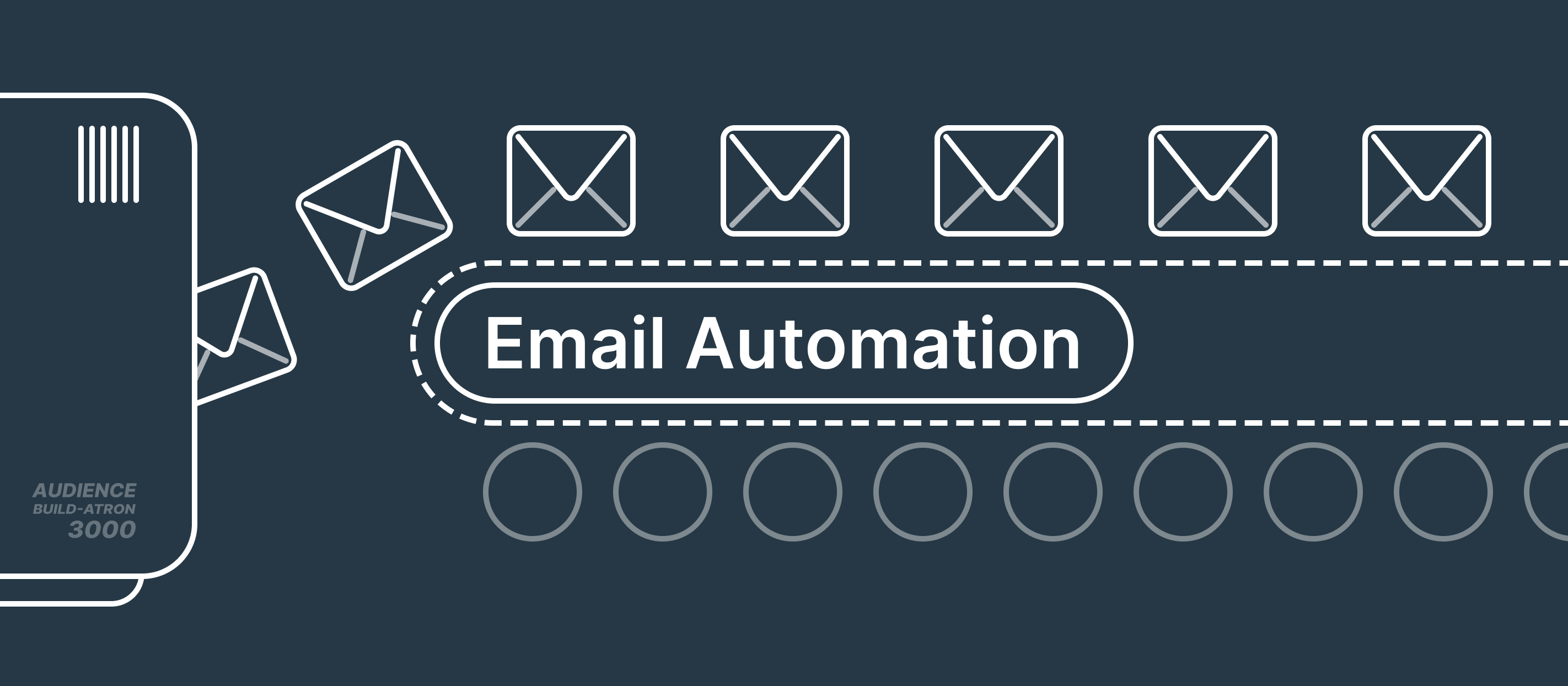
You may also be interested in: Email automation — the beginner’s guide
Marvel
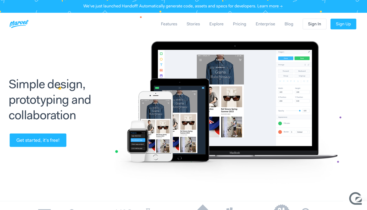
Marvel has kept their navigation clean and simple, and they’ve pushed all links over to the right, along with their CTAs. The logo hangs out on the left on its own, making it stand out on all pages. Hovering over the Marvel logo is fun and engaging – try it out yourself!
Microsoft
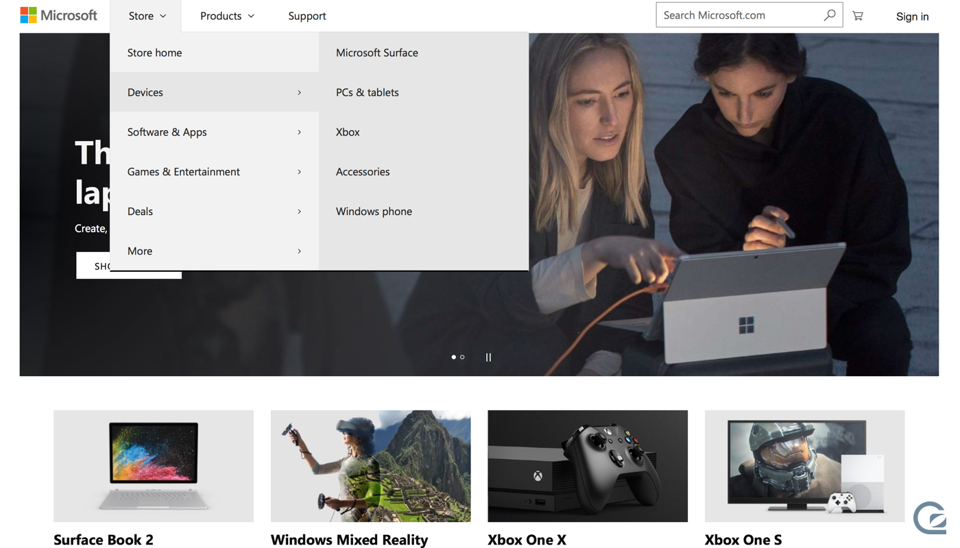
Microsoft’s website is of course huge, and has many thousands of pages. They’ve made huge steps to simplify the chaos, and the current navigation is clear and easy to jump around. Thankfully their search is also great at jumping you to the support documents you need too!
Segment
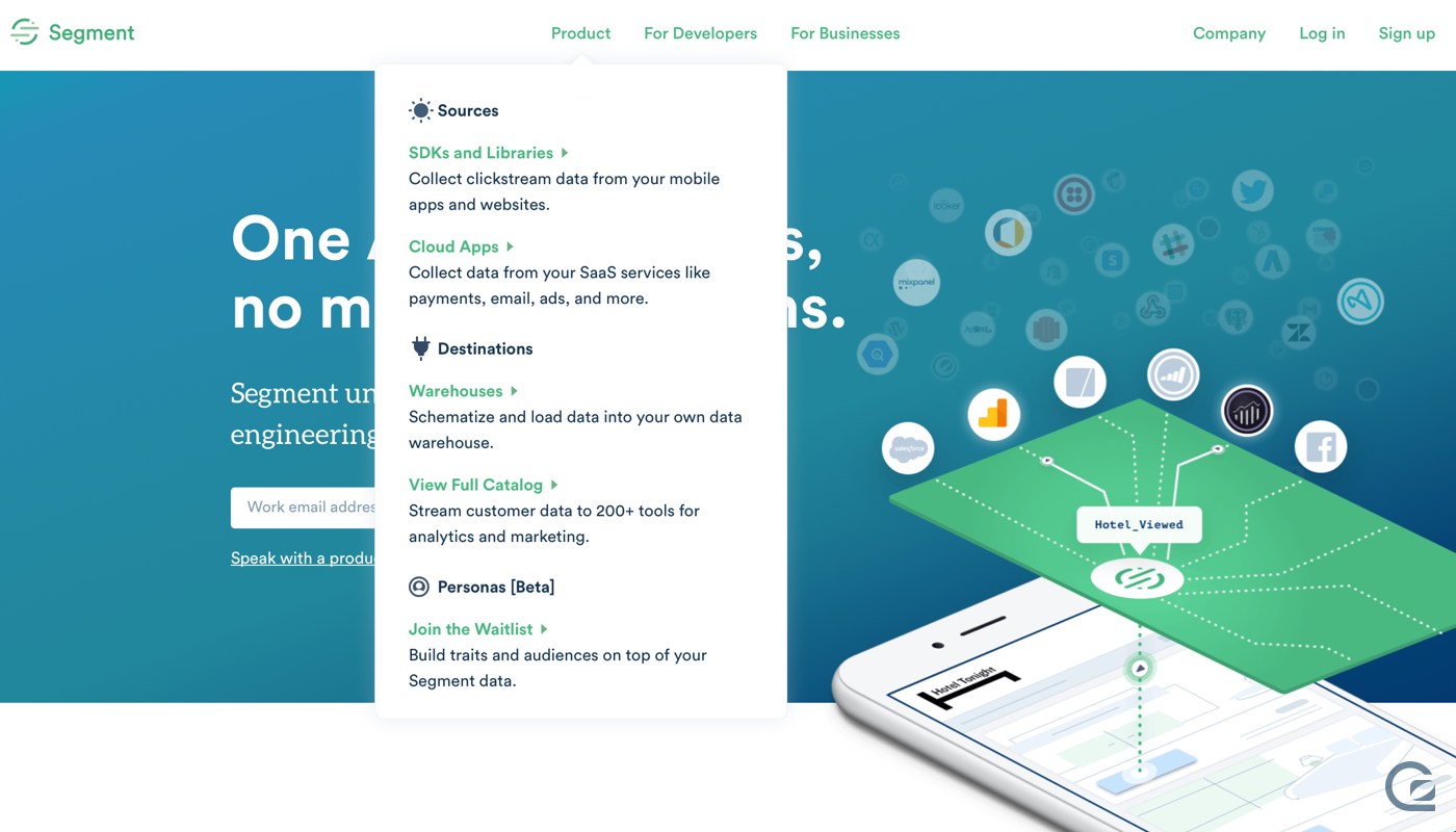
Segment’s website is always evolving, and their navigation has developed as their product has evolved. The latest navigation is great for jumping you to key product pages, but the drop down menus only show on click, rather than on hover, so are not as discoverable as they could be.
Shopify
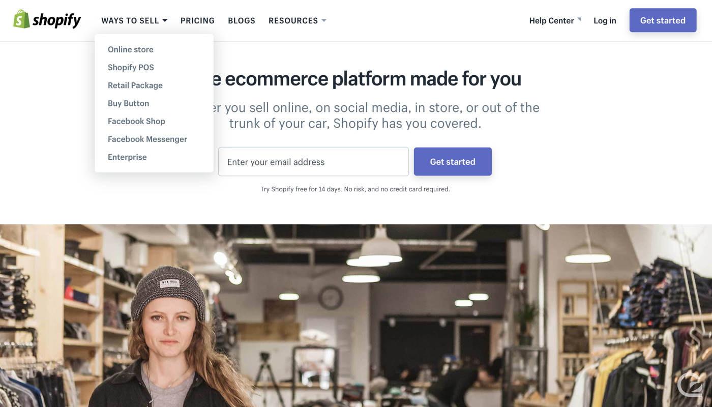
Shopify’s site utilises a few drop down menus to jump you to areas of the site that are important, but not worthy of their own link, emphasising the significance of their pricing and blog. A nice visual touch – they’ve used (but rotated) the same arrow they use to indicate the drop down menus to also indicate the help centre will open as a separate section of the site (outside of the current navigation structure).
Stripe
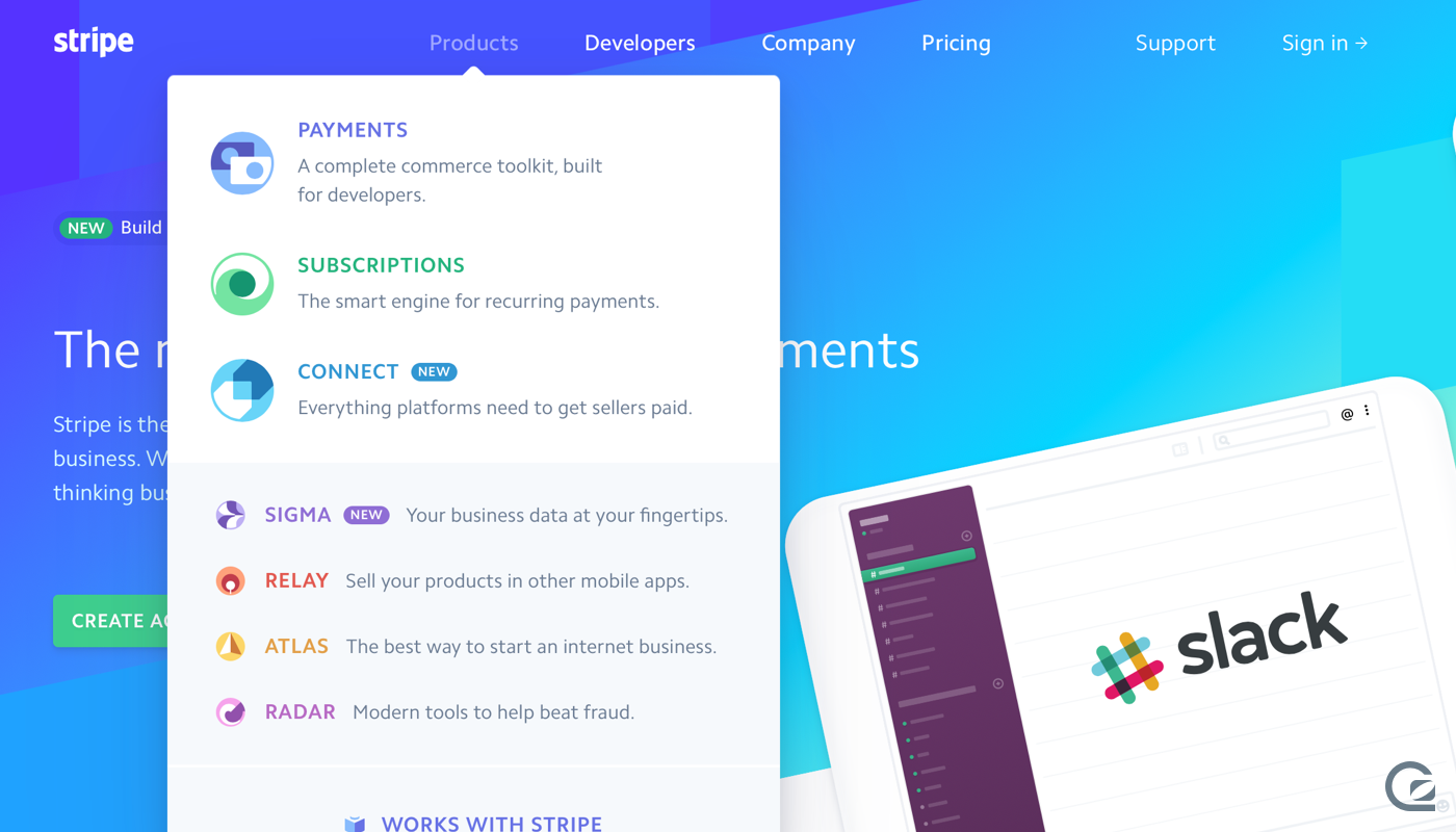
There’s no denying Stripe’s influence on other marketing sites, especially in the tech world. Stripe’s navigation is beautiful fluid, and is snappy while also looking visually slick. They’ve prioritised a few key sections to frame an otherwise confusingly large number of products and pages. Interestingly, Stripe left aligns their logo, while entering their key nav items, and keeps key CTAs over on the right.
Wistia

Wistia’s navigation certainly areas the mould – their key sections are listed along the top, but they also show a sub nav at all times that changes depending on which top level navigation item you’re on. Their CTAs on the far right take the full height of both the primary and secondary navigation bars. There’s also a third level of navigation once you’re hovering over a sub item, that displays below as a grid. It’s different but we love it!
Xero

Xero has a huge number of pages on their site, but their navigation structures the information in an easily scannable way. They also ensure the primary CTAs are easy to see, and include a search bar that is exactly where you’d expect it, without fighting for attention with the “Free trial” CTA.
Want to learn even more about the best website navigation tips and tricks? Download your free E-Book!
Congratulations on successfully navigating to the end of this post! We’d love to hear about your website navigation or design challenges, and see any examples of website navigation you think are truly great.
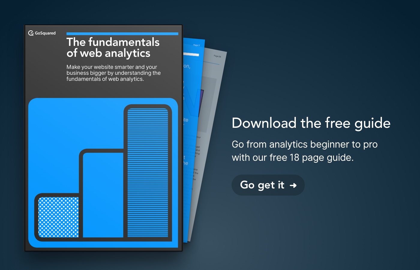
In the meantime, did you know here GoSquared we provide business owners with heaps of free resources to help you supercharge your marketing efforts? Click the image below to be taken to one of our resources, which is a free e-book on ‘The fundamentals of web analytics’.