
A web analytics report provides insights into your audience, your marketing campaigns, and your profitable sources of traffic. They can show you how well campaigns are working to bring you the sort of traffic you want.
But web analytics reports can be intimidating. You open one up, and you see a bunch of numbers and data that you’re not sure how to use. Or maybe you don’t even know how to generate a report.
In this post, we’re covering:
- How to create a web analytics report
- How to understand a web analytics report
- How to utilize a web analytics report (so you can put all your findings into action)
First up, let’s look into the step by step details on how to make a report. If you already know this, feel free to scroll on.
How to create a web analytics report

Unlike other analytics tools, GoSquared is incredibly straightforward and easy to understand. Other plusses include the free plan, and the weekly email reports that get sent straight to your inbox to help you keep track of your most important website analytics at a glance.
There are a few different options for installation.
You can copy and paste the tracking code in your website or you can use the WordPress plugin. Copy and paste your Project Token from the GoSquared platform into the plugin settings in WordPress and you are done.
If you’d like to track traffic and behavior in an iOS app instead of a website, you can do that as well.
After you’ve installed GoSquared, then your website visitors’ browsers will start sending data to the platform, automatically generating the reports for you.
Yup, that’s it. Creating a web analytics report is simply installing the right code in the right place, and then waiting for the data to collect so you can view it.
There are defaults for how the report will look in your dashboard. By default, certain sections will appear at the top of the report. But if you want to change the layout of the dashboard, then just click “Edit Layout” in the upper left-hand corner.
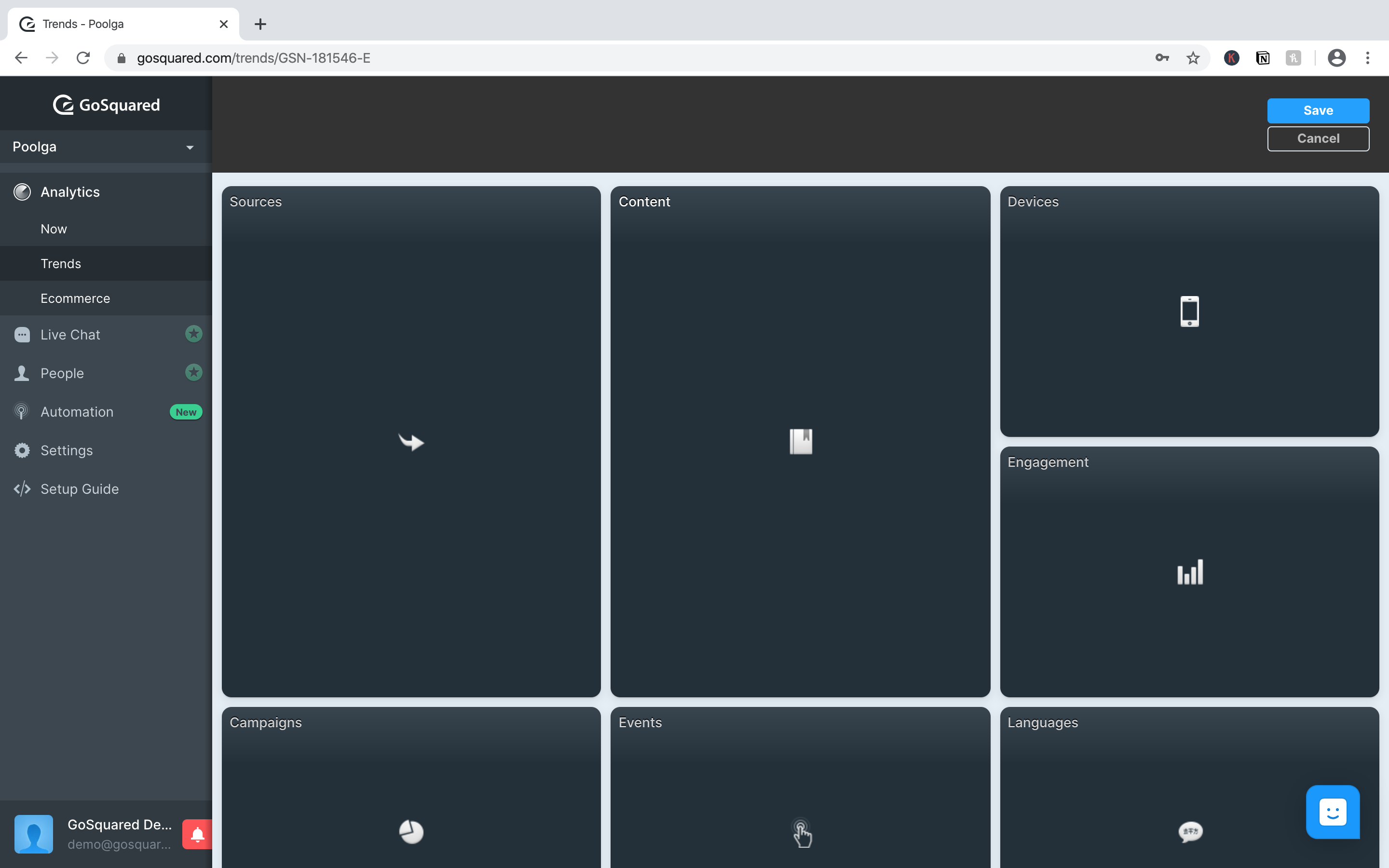
Then you can drag and drop the different sections of the report to prioritise them how you want them. Here, I’m moving Locations and Engagement to the top, and leaving Sources at the top.
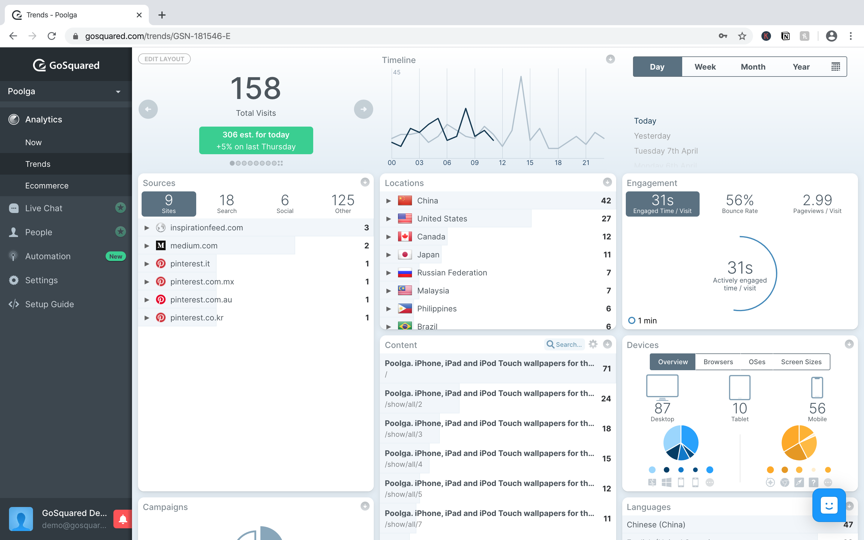
Now that I’ve changed the report to put what I’m most interested in on the top, here’s what it looks like.
How to understand a web analytics report

With your tracking setup and ready to go, GoSquared automatically generates three different reports: Now, Trends, and Ecommerce. Let’s take a look at these individually to see what insights you can learn from them. (Side note: all of these reports are GDPR compliant.)
Now report
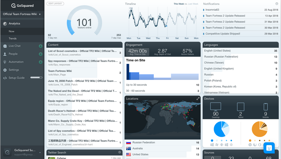
Let’s start with the Now report, which is designed to give you an immediate overview of what’s happening on your website this very instant, and the averages for all of the visitors that are actively using your website.
These are some of the key features in this report, and what they mean:
- Visitors online – The current number of active visitors.
- Traffic timeline – The amount of traffic for every day of this week, versus every day last week.
- Notifications – Important notifications about changes to your website, such as adding a new plugin or an RSS feed, so you can monitor changes your team is making at an overview.
- Sources – Your current top referring websites for traffic. These could be press features, social media accounts, or affiliate sites.
- Content – The top performing content in terms of number of views.
- Location – Where your current active visitors are coming from. This is always by country, so you can get a quick glance of your top visiting countries that instant.
- Engagement – The current average engagement levels of the people on your website: average minutes or seconds on your site, bounce rate percentage, pageviews per session on your site, and average time of active engagement (not just visit time).
- Campaigns – Unlike Sources, which shows you your top organic sources of traffic, Campaigns shows you your top referrers of paid traffic, and includes the number of referred visitors and the campaign name.
- Languages – Languages gives you the system languages for who is on your site, meaning what is the language setting of their device.
To see even more features that the Now report offers, check out this comprehensive list.
Trends report
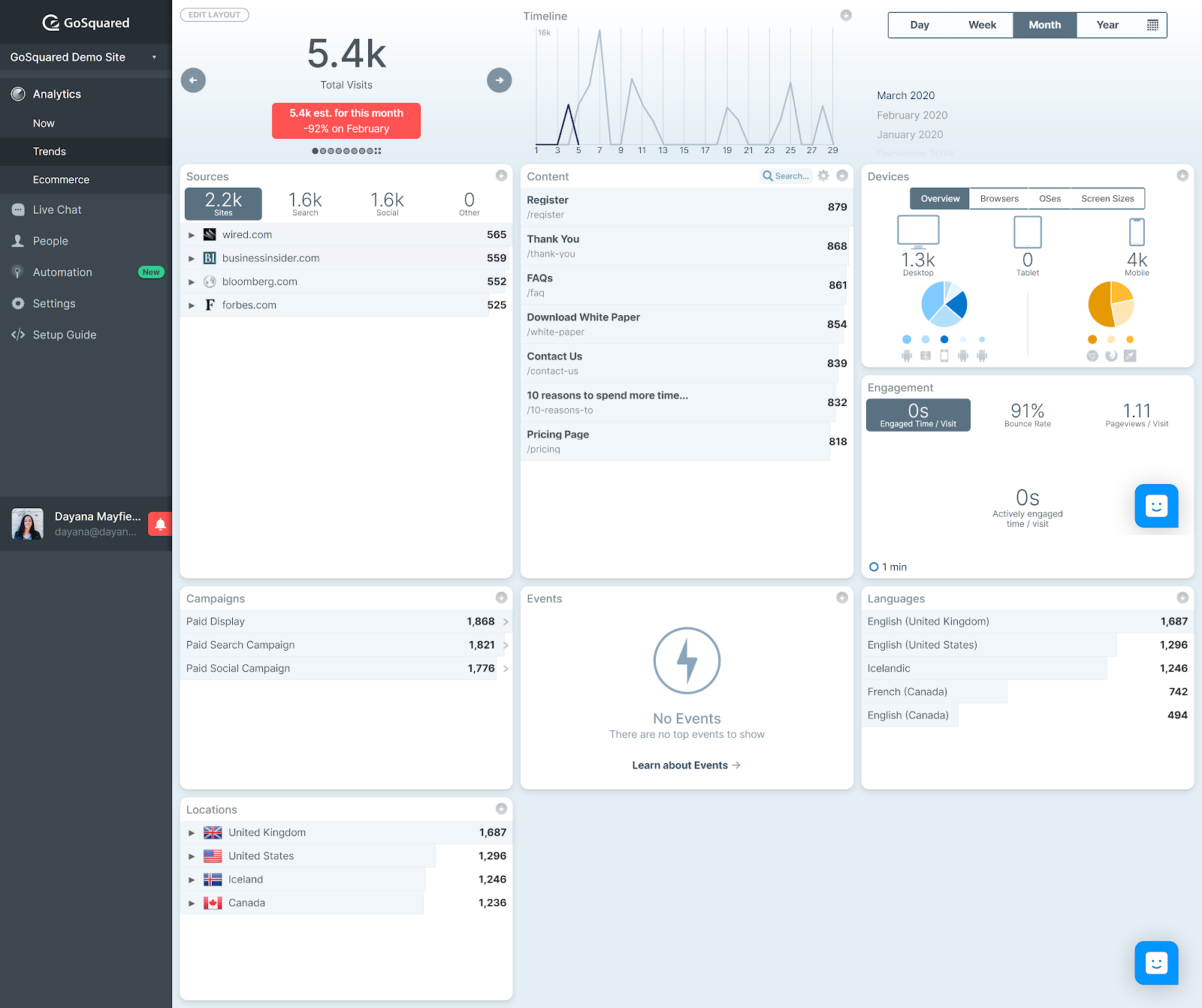
While the Now report shows you what’s happening right now, the Trends report gives you an overview of the averages for the day, the week, the month, the year, or any time range that you set.
These are the sections that appear up in the “Trends” report:
- Locations – Top countries in terms of traffic volume for whatever date range you choose.
- Sources – The websites that refer the most traffic to your site in the given date range.
- Engagement – The average levels of engagement within your selected time frame: time on site, active time on site, pages per session, seconds or minutes per session.
- Campaigns – The paid ad campaigns that send you the highest volume of traffic in your given time range.
- Devices – The top device types for the time range (mobile versus desktop versus tablet, as well as browsers, OSes, and screen sizes).
- Content – The top performing web pages, blog posts, and landing pages on your site within that time frame
- Languages – The most frequently used languages (device system language setting) in that data range
- Events – A list of all of the events and how many times each event was completed on your website in that timeframe, such as the number of contact forms filled out, the number of demos requested, etc.
To see even more features that the Trends report offers, check out this comprehensive list.
Ecommerce report
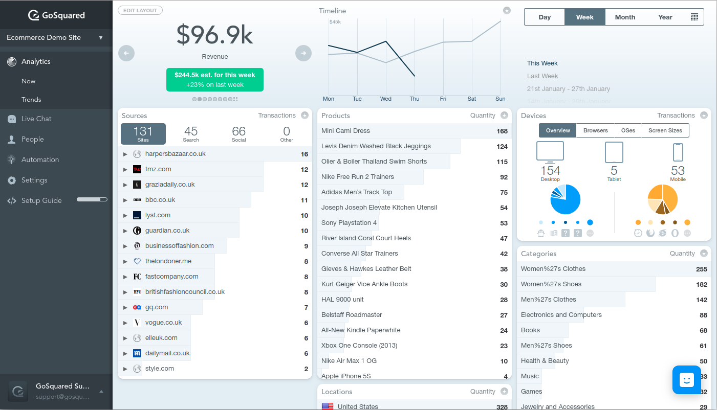
What makes the Ecommerce report unique is that you can see similar data as with the other two reports, but you can list the top sources, products, devices, and locations by revenue, transactions, order quantity, and website visits.
This means that instead of analyzing your website traffic just by looking at the volume and quality of traffic, you can now analyze traffic based on revenue, and start to see what is producing the greatest ROI.
- Revenue – See the amount of revenue gained by the day, week, month, year, or a custom date range.
- Revenue timeline – View your revenue timeline to compare this week’s revenue versus last week’s.
- Sources – Check out your top sites for referral traffic. Sort them in descending order by revenue, transactions, quantity, or website visits.
- Products – See which of your products are earning the most sales for any date range.
- Devices – Check out which device types, browsers, OSes, and screen sizes are the most profitable for you. This can help you know where to spend more of your ad dollars.
- Transactions – Take a look at transactions for your chosen date range and sort them by quantity or revenue.
- Languages – See which languages (device system languages that is) yield the highest revenue and order quantities.
- Categories – Learn which product categories are getting the most amount of sales.
To see even more features that the Ecommerce report offers, check out this comprehensive list.
How to utilise a web analytics report

Now that you know how to make reports and understand them, the next step is to turn those insights into actions you can implement.
Let’s take a look at a couple example insights from the different reports, and turn those into potential actions that you might want to take upon discovery.
Actions from Now report findings

Discover the cause for an unusual drop in engagement. If you login and check out the Now dashboard, and you find that your engagement is very different than what it is in the Trends report for any given timeline, then there might be something wrong on your site. You might want to double check to make sure that there are no unknown errors on important pages.
Better promote new content. Your Now report also shows you your top pages. If your newest blog post isn’t on the list, you might want to do more to promote that new piece of content.
Actions from Trends report findings

Localize your site in a popular language. Let’s say you discover that your second most popular language has really been gaining speed the last quarter. It might be time to localize your website for this language.
Create KPIs for important events. One of the coolest things about the Trends report is the event counts. You can make KPIs for how many ebook downloads or demo requests you want to see in a month, and then start tracking that goal and working to meet it.
Actions from Ecommerce report findings

Target a profitable country with new campaigns. Maybe you discover a profitable country that you hadn’t expected. First, you might want to look into how or why this country is finding out about you. (Do you have an influencer you’re not aware of?) Then you might want to target that country with organic and paid campaigns.
Find and utilize new traffic sources that are similar to your current most profitable sources. It’s smart to check out your top traffic sources by revenue. For example, if you discover that most of your profitable referrers are bloggers rather than big press outlets, then maybe you should capitalize on that success and reach out to more bloggers in your niche.
See…? Web analytics reports aren’t scary.
They’re easy to setup, and — when you know what you’re looking for — incredibly valuable and actionable.
Sign up for GoSquared and start generating your own high value website analytics.