How Fractional Hiring Can Save Your Business Money
Every company strives for continual growth. But with labour costs accounting for as much as 70% of total business costs,…
Numerics integration — bring GoSquared with you everywhere
Get your metrics on the go, or on the moon, with Numerics

-
![]()
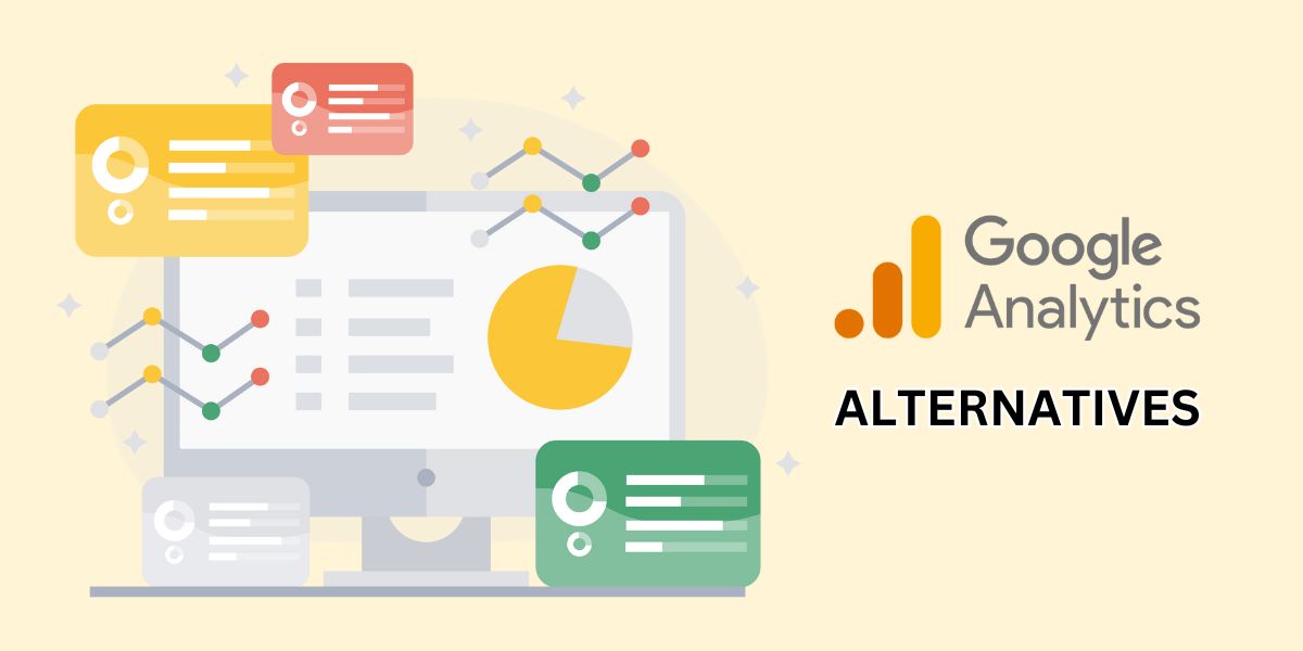
Struggling With Google Analytics 4? No, It’s Not Just You
If you’re reading this post because you needed a breather from trying to figure out Google Analytics 4, we hear…
-

Guide to using a CRM with email automation: the best triggers for the biggest impact
A CRM with email automation can help you keep in contact with your best leads, your new customers, and your long time customers using custom messaging.
-
![]()
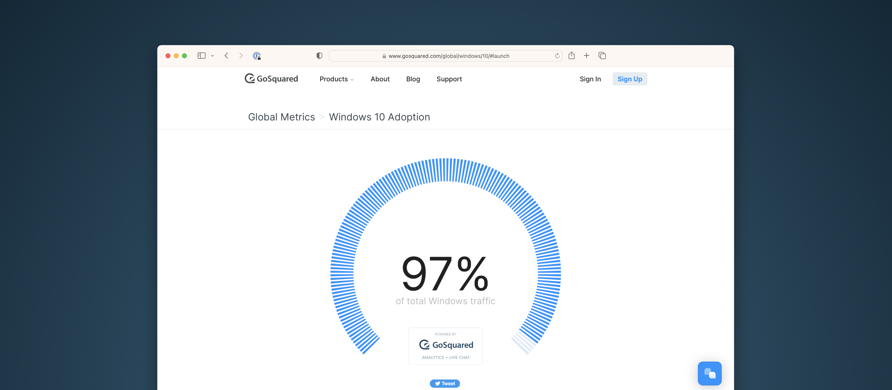
Saying Goodbye to Global Metrics
An update on Global Metrics, our site for measuring global web traffic.
-
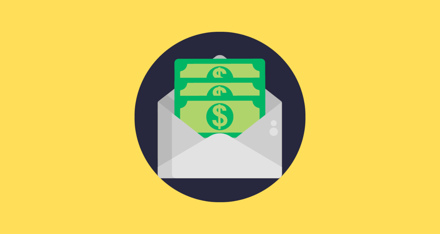
![Stop Making This Major Mistake With Your Email Signup Form]()
Stop Making This Major Mistake With Your Email Signup Form
So you’re spending money each month on an email marketing platform. For the likes of Mailchimp or HubSpot, we’d imagine that’s quite a…


GoSquared newsletter
All Posts
-
![11 Incredible Welcome Email Examples For 2023]()
11 Incredible Welcome Email Examples For 2024
In search of some welcome email examples to transform your campaigns? As one of the most valuable email types to exist, welcome…
-
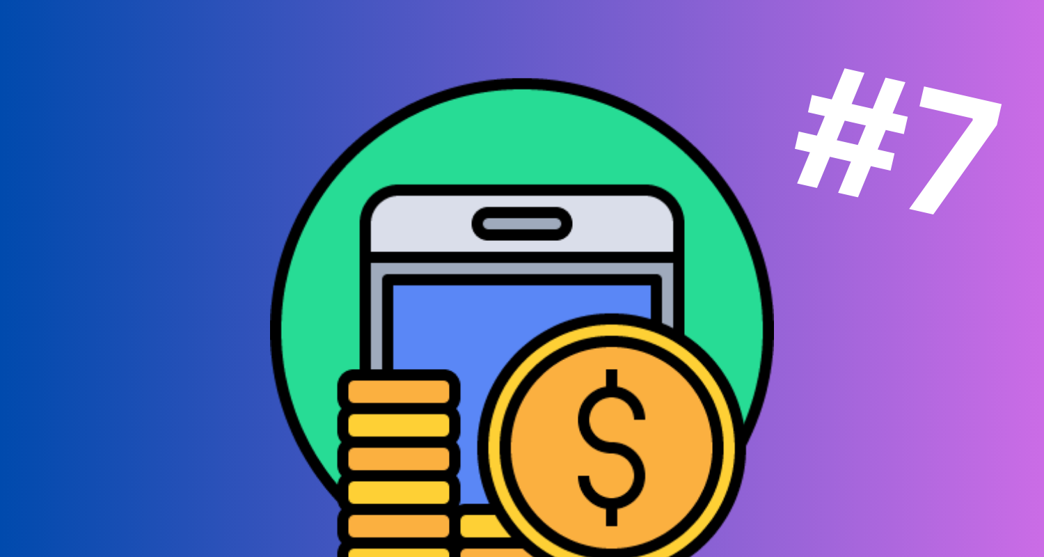
![7 Tips To Improve Email ROI]()
7 Tips To Improve Email Marketing ROI
Email marketing delivers average an average ROI of between $36 and $45 for every $1 spent. If you’re looking at…
-
![What Is Email Marketing? Beginner's Guide, Definition & Strategies]()
What Is Email Marketing? Beginner’s Guide, Definition & Strategies
Here because you just Googled ‘what is email marketing‘? 🔎 ✉️ Listen. It’s easy to assume that just because email…
-
![AI Marketing Tools: How To Succeed And Where To Hold Back]()
AI Marketing Tools: How To Succeed And Where To Hold Back
It’s a simple fact that AI marketing tools were always going to exist and continue to blow our minds as…
-
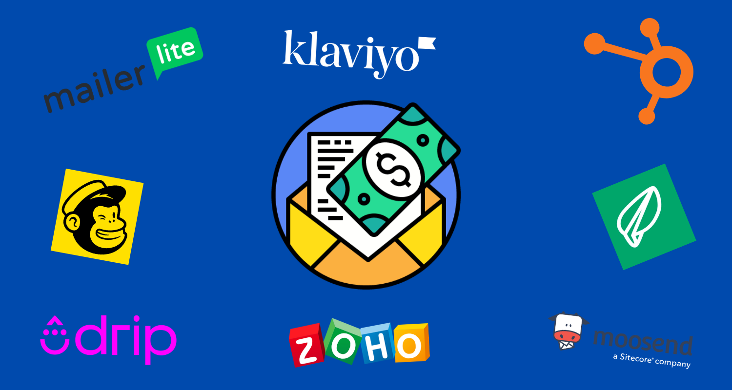
![Every Email Platform Ranked From Cheapest To Most Expensive In 2023]()
Every Email Platform Ranked From Cheapest To Most Expensive In 2023
In search of an email marketing platform that doesn’t cost the earth? Ironically, that’s exactly how we’d describe our new…